Stat 437 Lecture Notes 1b
Xiongzhi Chen
Washington State University
Visualization: brief overview
Why visualization?
Data visualization
- provides preliminary understanding of data
- helps present and disseminate knowledge
- is a relatively under-developed subject of high-dimensional data science
Different features of data and different focuses of visualization require different visualization software.
Two visualization paradigms
Static visualization: a snapshot of a data set (non-interactive)
Dynamic visualization: a sequence of snapshots of a data set, or a snapshot of a data set that a user can interact with
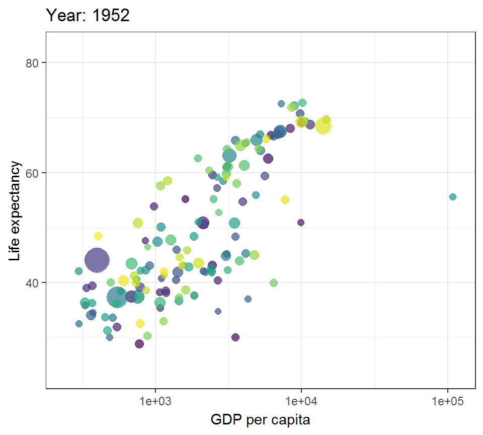
An illustration
Static:

An illustration
Interactive:
An illustration
Animated:
Static visualization
There are several R packages or commands for static data visualization:
- Package
ggplot2, which visualizes data frames and will be used most for this course - R command
plot, which comes with R, visualizes data frames, and has basic functionalities
Static visualization
(continued from previous slide):
- Package
igraph, which creates graphs (as representations of network data such as friendship networks) - Package
ggdendro, which creates dendrograms and tree diagrams (for clustering tasks) - Package
ggmap, which visualizes data frames over maps (e.g. for insurance data or agricultural data)
Dynamic visualization
There are also R packages for dynamic data visualization
- Package
plotly, which visualizes data frames dynamically - Package
gganimate, which visualizes data frames dynamically
These packages and those mentioned in the previous slide are somehow connected with and based on ggplot2. There are other specialized R packages that we will not talk about.
ggplot2
Overview
The basic elements and principles of visualization using ggplot2 can be found in Chapter 1 of the book “ggplot2: elegant graphs for data analysis” by Hadley Wickham.
This book can be thought of as a much detailed version Chapter 1 of the book “R for data science” by Wickham and Grolemun.
Overview
The elements involved in a ggplot2 plot are:
- data, aesthetic mappings, geometric objects,
- statistical transformations
- scales, coordinate system
- facet
The elements will be integrated via ggplot2 grammar.
In short:
- a plot maps data to visual elements via specific grammar
- ggplot2 builds a plot layer by layer.
On some terms
Aesthetic mappings describe how variables in data are mapped to aesthetic attributes that we can perceive
Geometric objects, “geoms” for short, represent what we actually see on the plot
Statistical transformations, “stats” for short, summarise data in many useful ways
Scales map values in data space to values in an aesthetic space, and draw a legend or axes
A faceting specification describes how to break up data into subsets and how to display the subsets
An illustration on ggplot2
The mpg data frame comes with ggplot2 (aka ggplot2::mpg) and will be used to illustrate the basic grammar of ggplot2 and the principle of “build a plot by layer”.
An illustration on ggplot2
> library(ggplot2)
> # use help(dataset) to get a description on the data
> # help(mpg)
> mpg
# A tibble: 234 x 11
   manufacturer model displ  year   cyl trans drv     cty   hwy
   <chr>        <chr> <dbl> <int> <int> <chr> <chr> <int> <int>
 1 audi         a4      1.8  1999     4 auto~ f        18    29
 2 audi         a4      1.8  1999     4 manu~ f        21    29
 3 audi         a4      2    2008     4 manu~ f        20    31
 4 audi         a4      2    2008     4 auto~ f        21    30
 5 audi         a4      2.8  1999     6 auto~ f        16    26
 6 audi         a4      2.8  1999     6 manu~ f        18    26
 7 audi         a4      3.1  2008     6 auto~ f        18    27
 8 audi         a4 q~   1.8  1999     4 manu~ 4        18    26
 9 audi         a4 q~   1.8  1999     4 auto~ 4        16    25
10 audi         a4 q~   2    2008     4 manu~ 4        20    28
# ... with 224 more rows, and 2 more variables: fl <chr>,
# class <chr>- manufacturer; model, displ (engine displacement, in litres)
- year, cyl, trans (type of transmission)
An illustration on gpplot2
Plot displ (engine displacement) versus hwy (highway mileage)
> library(ggplot2)
> p1= ggplot(data = mpg) +
+ geom_point(mapping = aes(x = displ, y = hwy))- “p1” is the handle for the plot
- the geometric object
geom_pointis “point”, - the aesthetic mapping
mapping = aesmaps “displ” and “hwy” to x-y coordinates using the original scales of measurements in data “mpg”
An illustration on gpplot2
> library(ggplot2)
> p1  # show p1 in display device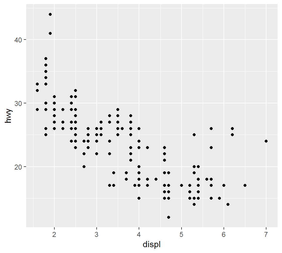
An illustration on gpplot2
> ggplot(data = mpg) +
+ geom_line(mapping = aes(x = displ, y = hwy))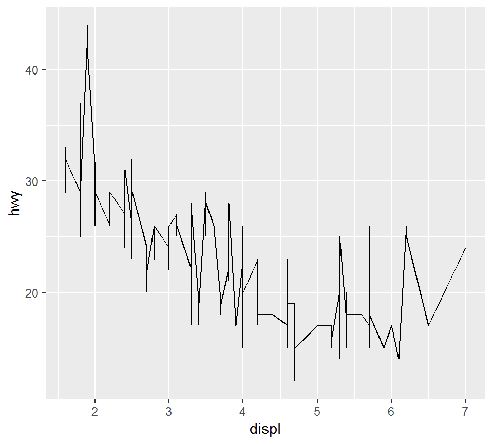 The geometric object is
 geom_line, i.e., “line”
A graphing template
The basic structure of a ggplot2 plot command:
ggplot(data = <DATA>) +
<GEOM_FUNCTION>(mapping = aes(<MAPPINGS>))
Compare the above with
ggplot(data = mpg) +
geom_point(mapping = aes(x = displ, y = hwy))
There are various geometric objects and aesthetic mappings, which will be introduced and discussed later.
Elementary visualization
Overview
Using the mpg data set, we will illustrate several instances of elementary visualization, including
- Scatter plot
- Density plot, histogram
- Boxplot
- Bar plot, pie chart
The “mpg” data set
Focus on:
- displ (engine displacement, in litres), hwy (highway miles per gallon), class (suv, pickup, …), drv (f = front-wheel drive, r = rear wheel drive, 4 = 4wd)
> library(ggplot2); library(dplyr)
> mptmp = mpg %>% select(displ, class,drv, hwy)
> head(mptmp)
# A tibble: 6 x 4
  displ class   drv     hwy
  <dbl> <chr>   <chr> <int>
1   1.8 compact f        29
2   1.8 compact f        29
3   2   compact f        31
4   2   compact f        30
5   2.8 compact f        26
6   2.8 compact f        26
Note object type for each variable
The “mpg” data set
Convert character variables in mpg into factors by dplyr::mutate_if (to apply different aesthetics):
> library(dplyr)
> mpg = mpg %>% dplyr::mutate_if(is.character,as.factor)
> class(mpg$class)
[1] "factor"
> unique(mpg$class)
[1] compact    midsize    suv        2seater    minivan
[6] pickup     subcompact
7 Levels: 2seater compact midsize minivan ... suv
> class(mpg$drv)
[1] "factor"
> unique(mpg$drv)
[1] f 4 r
Levels: 4 f r
Scatter plot
Scatter plot
- is simple and widely used
- is used to display measurements in terms of coordinates
A scatter plot
Plot displ versus hwy as “points”:
> ggplot(mpg)+geom_point(aes(x = displ, y = hwy))
The color aesthetic
Plot displ versus hwy as “points”, so that points for each class have its own color
> library(ggplot2)
> p1a = ggplot(mpg) +
+ geom_point(aes(x = displ, y = hwy, color = class))- “p1a” is the figure handle
- note
geom_pointand thecoloraesthetic
Compare the above command with:
ggplot(mpg)+geom_point(aes(x = displ, y = hwy))The color aesthetic
> library(ggplot2); p1a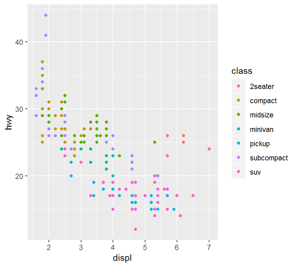
The shape aesthetic
Plot displ versus hwy “points”, so that points for each class have its own shape
> library(ggplot2)
> p1b = ggplot(mpg) +
+   geom_point(aes(x = displ, y = hwy, shape = class))
> # note the `shape` aesthetic
>
> length(unique(mpg$class))
[1] 7
> # there are 7 classes
The shape aesthetic
> library(ggplot2); p1b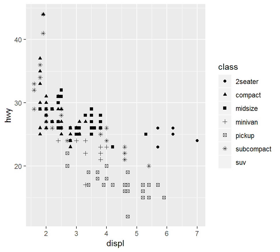
The shape aesthetic
A warning message will result from
ggplot(mpg) +
geom_point(aes(x = displ, y = hwy, shape = class))
since there are more than 6 class level but shape values are not manually provided. Namely, unless otherwise specified, only 6 default shape values are used.
This can be resolved by
ggplot(mpg) +
geom_point(aes(x = displ, y = hwy, shape = class))+
scale_shape_manual(values = 1:length(unique(mpg$class)))
The shape aesthetic
> p1b +
+   scale_shape_manual(values = 1:length(unique(mpg$class)))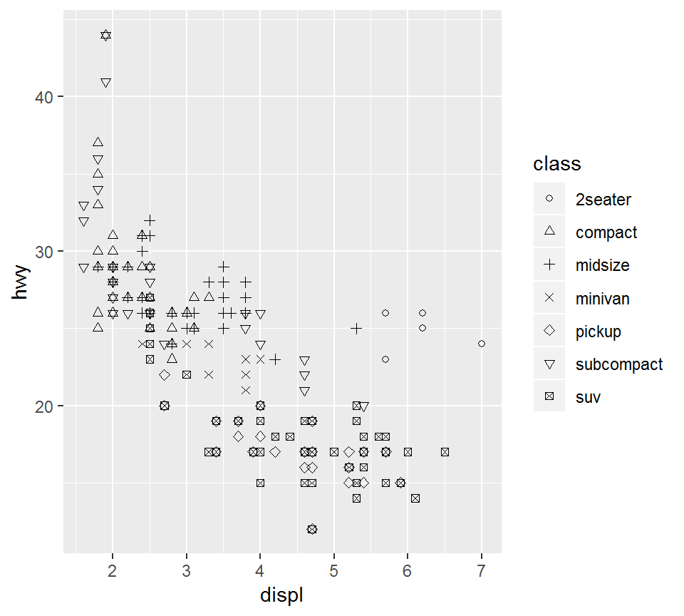
Add axis labels and title
> p1b +xlab("Engine displacement") +ylab("Highway mileage")+
+   ggtitle("Efficiency")+scale_shape_manual(values = 1:7)+
+   theme(plot.title = element_text(hjust = 0.5))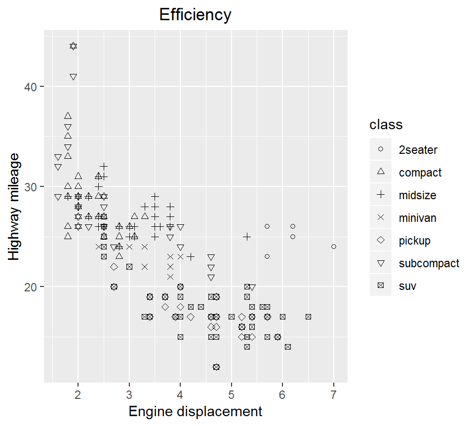
Add axis labels and title
Note that axis labels and title are added via xlab, ylab, ggtitle and should all be characters or strings. For the latest version of ggplot2, the following command
theme(plot.title = element_text(hjust = 0.5))centers the title; otherwise, the title will be aligned left.
Density plot
Density plot can be used to:
- visually check model assumptions (such as if random errors are Gaussian)
- visually compare a response’s behavior under different conditions (such as sales amount in different seasons)
Density plot: geom_density
Create a density plot for hwy for each of 3 class, i.e., “compact”, “suv”, or “2seater” and via dashed line linetype = "dashed"
> library(dplyr)
> mpg1 = mpg %>%
+    filter(class %in% c("compact","suv","2seater"))
>
> library(ggplot2)
> p2 = ggplot(mpg1, aes(x=hwy, color=class)) +
+ geom_density(linetype = "dashed") + theme_bw()theme_bw()chooses the white backbround with grid guidelines
Density plot: geom_density
> library(ggplot2); p2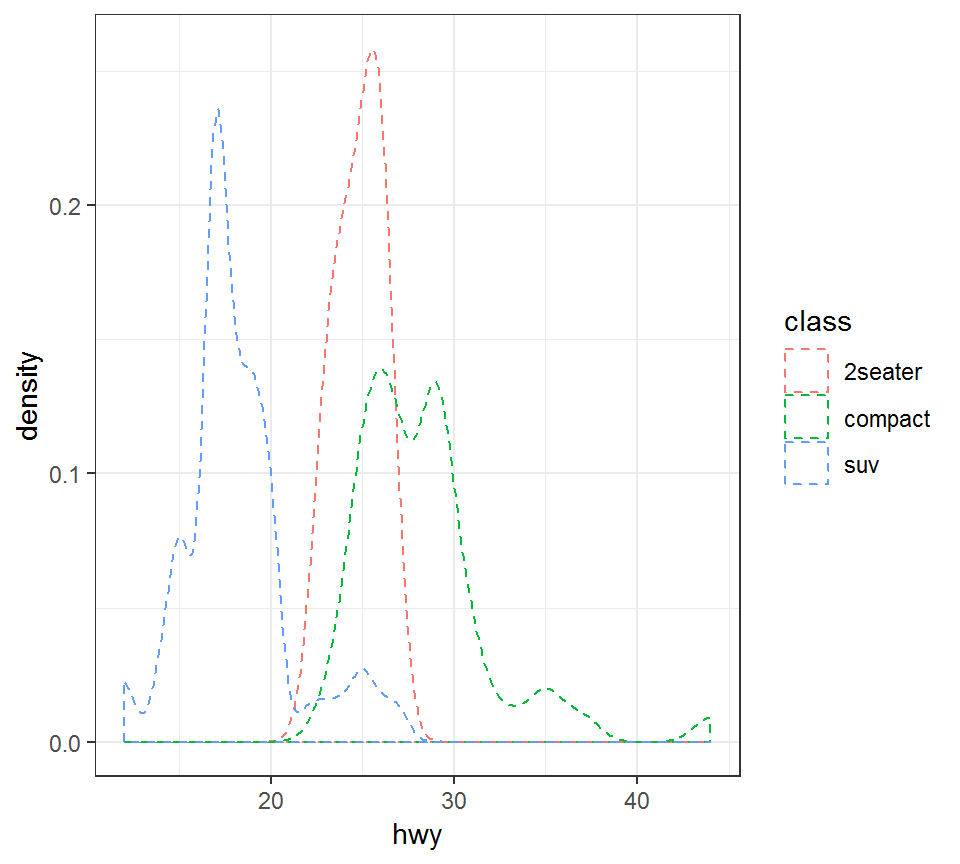
Histogram: geom_histogram
Create a histogram for hwy for each of 3 class, i.e., “compact”, “suv”, or “2seater”:
> library(ggplot2); library(dplyr)
> p2c = ggplot(mpg1, aes(x=hwy, fill=class)) +
+   geom_histogram(bins = 20,position="dodge") + theme_bw()
bins = 20breaks the range ofhwyinto 20 equal-sized bins, in order to create the histogramposition="dodge"shifts bars in histogram a bit to avoid overlayfill=classgives a color to a histogram as per itsclassvalue
Histogram: geom_histogram
> library(ggplot2); p2c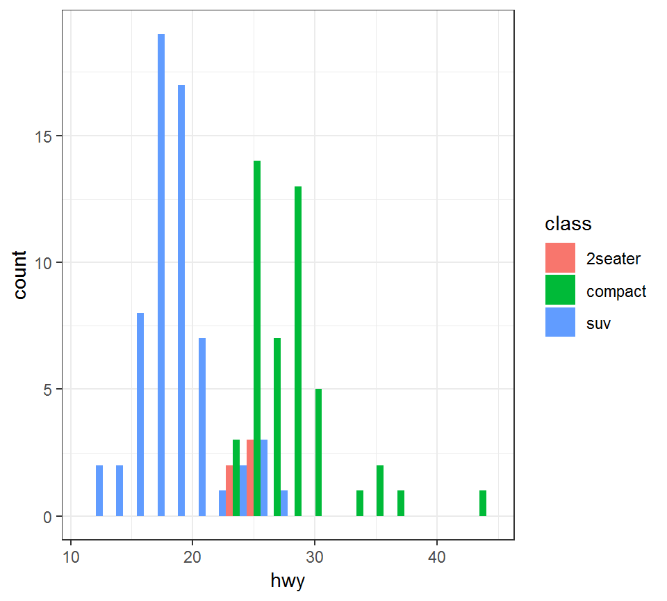
Boxplot
Boxplot, also referred to as the “5 point summary”, does not present full distributional information as density plot. But it can be used to visually check:
- median of data; range of data; skewness of data
- outliers in data (determined with respect to inter-quartile range)
Boxplot: geom_boxplot
Create a boxplot for hwy for each of the 3 class, i.e., “2seater”, “compact” and “suv”, by also adding the mean of hwy for a class type:
> library(ggplot2)
> p3= ggplot(mpg1,aes(x=class,y=hwy))+geom_boxplot()+
+   theme_bw()+
+ stat_summary(fun.y=mean,geom="point",shape=23,size=4)stat_summaryprovides summary statistic(s) specified byfun.y=mean, i.e., computes the mean ofy(i.e.,hwy)geom="point",shape=23,size=4plots the mean as a point withshapeandsizevalues as specified
Boxplot: geom_boxplot
> library(ggplot2); p3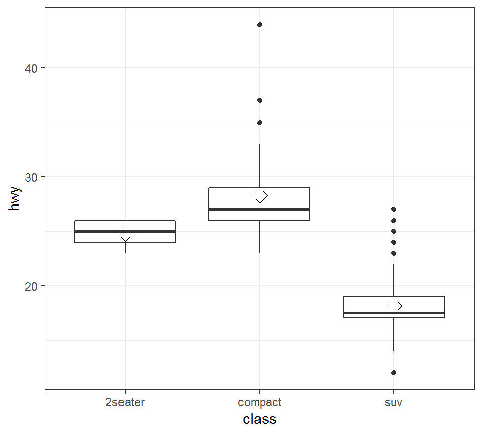
Boxplot: geom_boxplot
Remarks:
- The middle bar in a boxplot represents the median
stat_summaryis able to implement a statistical transformation ofxoryinaes, including mean, standard deviation; please use?ggplot2::stat_summaryto get more informationshapeandsizecan take different values than used in the previous plot; for shapes, please see http://www.cookbook-r.com/Graphs/Shapes_and_line_types/.
Bar plot: geom_bar
A bar plot represents a quantity of interest via height
Bar plot: geom_bar
Bar plot for hwy for each of the 3 class, i.e., “2seater”, “compact” and “suv”, colored by drv:
> library(ggplot2)
> p4 = ggplot(mpg1)+theme_bw()+
+   geom_bar(aes(x=class,y=hwy,fill=drv),stat='identity',
+ position='dodge')fillwill give a color for the bar plot for eachdrvstat='identity'means “do not transform data”position='dodge'means “shift bars a bit if they overlap”
Bar plot: geom_bar
> library(ggplot2); p4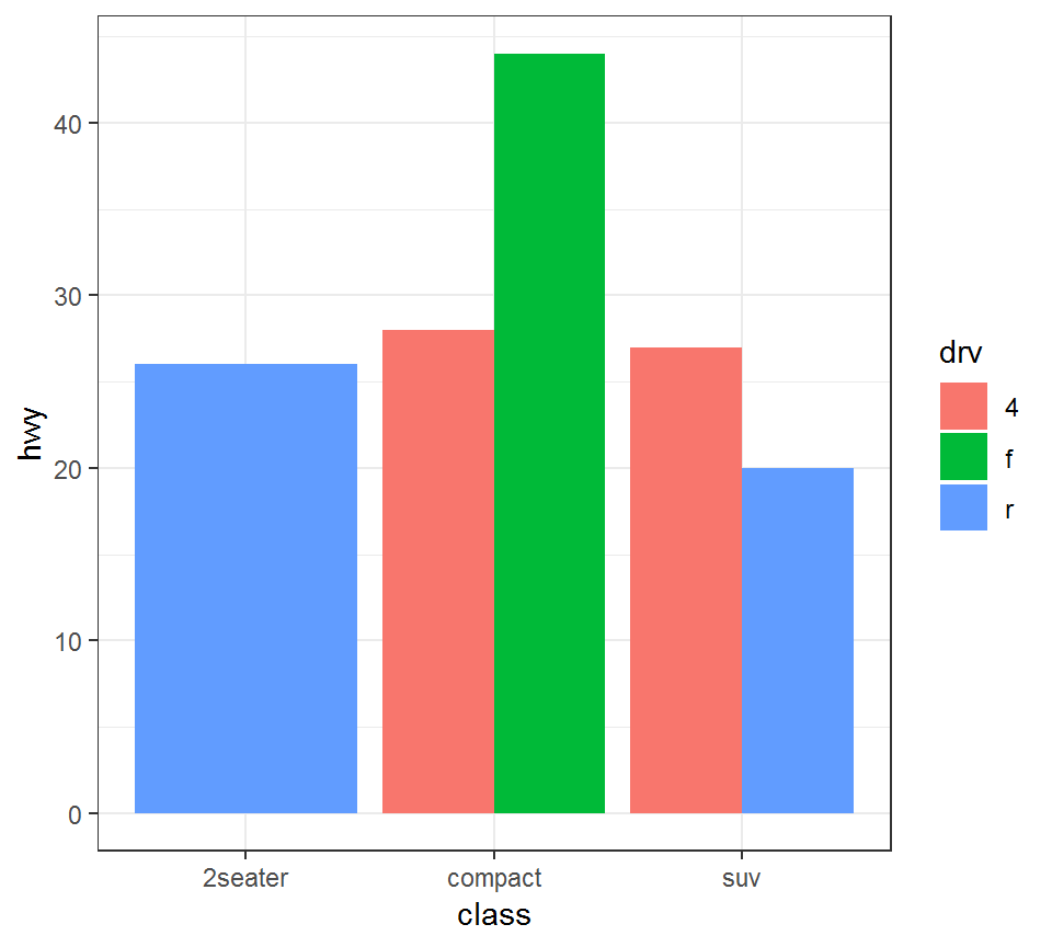
Bar plot: geom_bar
Additional information on the plot in the previous slide:
> mpg0 = mpg1 %>% filter(class=="2seater")
> unique(mpg0$drv)
[1] r
Levels: 4 f r
> mpg2 = mpg1 %>% filter(class=="suv")
> unique(mpg2$drv)
[1] r 4
Levels: 4 f r
> mpg3 = mpg1 %>% filter(class=="compact")
> unique(mpg3$drv)
[1] f 4
Levels: 4 f r
Pie chart
Pie chart
- represents a quantity of interest via proportion
- takes more efforts to create than, e.g., bar plot
Pie chart
Create a pie chart for 3 class, i.e., “2seater”, “compact” and “suv”:
> library(ggplot2); library(scales)
> # load `scales` package in order to scale data
> mpg2 = mpg1 %>% group_by(class) %>%
+   count() %>% ungroup() %>%
+   mutate(percentage=`n`/sum(`n`)) %>%
+   arrange(desc(class))
>
> # create labels using the percentages
> mpg2$labels <- scales::percent(mpg2$percentage)- group data via
class, obtain counts for each class, compute percentages from counts, and arrange classes by their descending percentages - Caution:
ungroup()is needed aftergroup_by(...) %>% count()
Pie chart
Take a look at mpg2, which is the processed mpg1:
> mpg2
# A tibble: 3 x 4
  class       n percentage labels
  <fct>   <int>      <dbl> <chr>
1 suv        62     0.544  54.4%
2 compact    47     0.412  41.2%
3 2seater     5     0.0439 4.4%
Note: labels as percentages have been created; they will be used to mark the proportions on a pie chart
Pie chart
Create a pie chart via geom_bar:
> library(ggplot2)
>
> pie = ggplot(mpg2)+
+ geom_bar(aes(x="", y=percentage, fill=class),
+          stat="identity", width = 1)+
+   coord_polar("y", start=0)+  theme_void()+
+   geom_text(aes(x=1, y = cumsum(percentage) - percentage/2,
+ label=labels))coord_polarconverts bar plot into pie charttheme_void()means “a completely empty theme”; otherwise, the resulting pie chart does not look so nicegeom_textaddslabelsto label different parts of a plot at their desginated positionslabelsinmpg2is used to label the proportions
Pie chart
> library(ggplot2);pie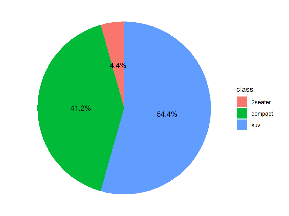
License and session Information
> sessionInfo()
R version 3.5.0 (2018-04-23)
Platform: x86_64-w64-mingw32/x64 (64-bit)
Running under: Windows 7 x64 (build 7601) Service Pack 1

Matrix products: default

locale:
[1] LC_COLLATE=English_United States.1252
[2] LC_CTYPE=English_United States.1252
[3] LC_MONETARY=English_United States.1252
[4] LC_NUMERIC=C
[5] LC_TIME=English_United States.1252

attached base packages:
[1] stats     graphics  grDevices utils     datasets  methods
[7] base

other attached packages:
[1] scales_1.0.0   dplyr_0.7.8    bindrcpp_0.2.2 shiny_1.2.0
[5] webshot_0.5.1  plotly_4.8.0   ggplot2_3.1.0  knitr_1.21

loaded via a namespace (and not attached):
 [1] revealjs_0.9       tidyselect_0.2.5   xfun_0.4
 [4] purrr_0.2.5        colorspace_1.3-2   htmltools_0.3.6
 [7] viridisLite_0.3.0  yaml_2.2.0         utf8_1.1.4
[10] rlang_0.3.0.1      pillar_1.3.1       later_0.7.5
[13] glue_1.3.0         withr_2.1.2        RColorBrewer_1.1-2
[16] bindr_0.1.1        plyr_1.8.4         stringr_1.3.1
[19] munsell_0.5.0      gtable_0.2.0       htmlwidgets_1.3
[22] evaluate_0.12      labeling_0.3       httpuv_1.4.5.1
[25] crosstalk_1.0.0    fansi_0.4.0        Rcpp_1.0.0
[28] xtable_1.8-3       promises_1.0.1     jsonlite_1.6
[31] mime_0.6           digest_0.6.18      stringi_1.2.4
[34] grid_3.5.0         cli_1.0.1          tools_3.5.0
[37] magrittr_1.5       lazyeval_0.2.1     tibble_1.4.2
[40] crayon_1.3.4       tidyr_0.8.2        pkgconfig_2.0.2
[43] data.table_1.11.8  assertthat_0.2.0   rmarkdown_1.11
[46] httr_1.4.0         rstudioapi_0.8     R6_2.3.0
[49] compiler_3.5.0