Stat 437 Lecture Notes 2a
Xiongzhi Chen
Washington State University
Advanced visualization via ggplot2
Overview
We will cover: (a) faceting; (b) annotating a plot; (c) manually setting some scales; (d) adjusting some guides (e.g., legends and axis); (e) mathematical expressions in plots.
The contents for (a) to (d) are based on Chapter 1 of the book “R for data science” by Wickham and Grolemun, and on Chapters 5, 6 and 7 of the book “ggplot2: elegant graphs for data analysis” by Hadley Wickham.
Faceting
The mpg dataset
mpg1 is a subset of mpg; class refers to “type” of car, and drv type of drive
> # show levels of a factor
> levels(mpg1$class)
[1] "2seater"    "compact"    "midsize"    "minivan"
[5] "pickup"     "subcompact" "suv"
> levels(mpg1$drv)
[1] "4" "f" "r"- levels of a factor are ordered numerically and then alphabetically; this explains why “4” is ordered before “f” and “r”, and why “2seater” before “compact”
Faceting
A data set can be split into subsets based on some criteria. For example, the mileage dataset
mpgcan be split into 7 subsets according the 7 levels ofclass, or into 3 subsets according to the 3 levels ofdrv.We have already discussed using aesthetics (e.g.,
colorandshape) to compare or visualize subsets. Faceting takes an alternative approach by creating the same graph for each subset/subgroup of a data set and displaying the graphs in a table.
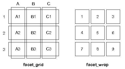
Two types of faceting
Two types of faceting are provided by ggplot2:
facet_gridproduces a 2d grid of panels defined by variables which form the rows and columnsfacet_wrapproduces a 1d ribbon of panels that is wrapped into 2d
Two types of faceting
Difference between facet_grid and facet_wrap:
Faceting: facet_wrap
Basic syntax:
facet_wrap(facets, nrow = NULL, ncol = NULL,
  scales = "fixed", labeller = "label_value")
The
facetscan be specified by~variableorvars(variable)nrow(orncol) sets number of rows (or columns) in which graphs are displayedWe will talk about
scalesandlabellerlaterUse
?facet_wrapto get more information
mpg data set
A quick look at factors drv, cyl, class and manufacturer
> library(ggplot2)
> # obtain levels of `drv`
> levels(mpg$drv)
[1] "4" "f" "r"
>
> unique(mpg$cyl)
[1] 4 6 8 5
>
> levels(mpg$class)
[1] "2seater"    "compact"    "midsize"    "minivan"
[5] "pickup"     "subcompact" "suv"
>
> levels(mpg$manufacturer)
 [1] "audi"       "chevrolet"  "dodge"      "ford"
 [5] "honda"      "hyundai"    "jeep"       "land rover"
 [9] "lincoln"    "mercury"    "nissan"     "pontiac"
[13] "subaru"     "toyota"     "volkswagen"
Note how levels of a factor are ordered.
facet_wrap: illustration
Plot displ versus hwy for each level of class via faceting with rowwise layout:
> # build a base layer
> p1= ggplot(data = mpg)+
+   geom_point(mapping = aes(x = displ, y = hwy))
>
> # add faceting via `class` to p1
> p2 = p1 + facet_wrap(~class, nrow = 2)- note the use of
~class;classhas 7 levels nrowspecifies in how many rows the plots should be displayed
facet_wrap: illustration
> p2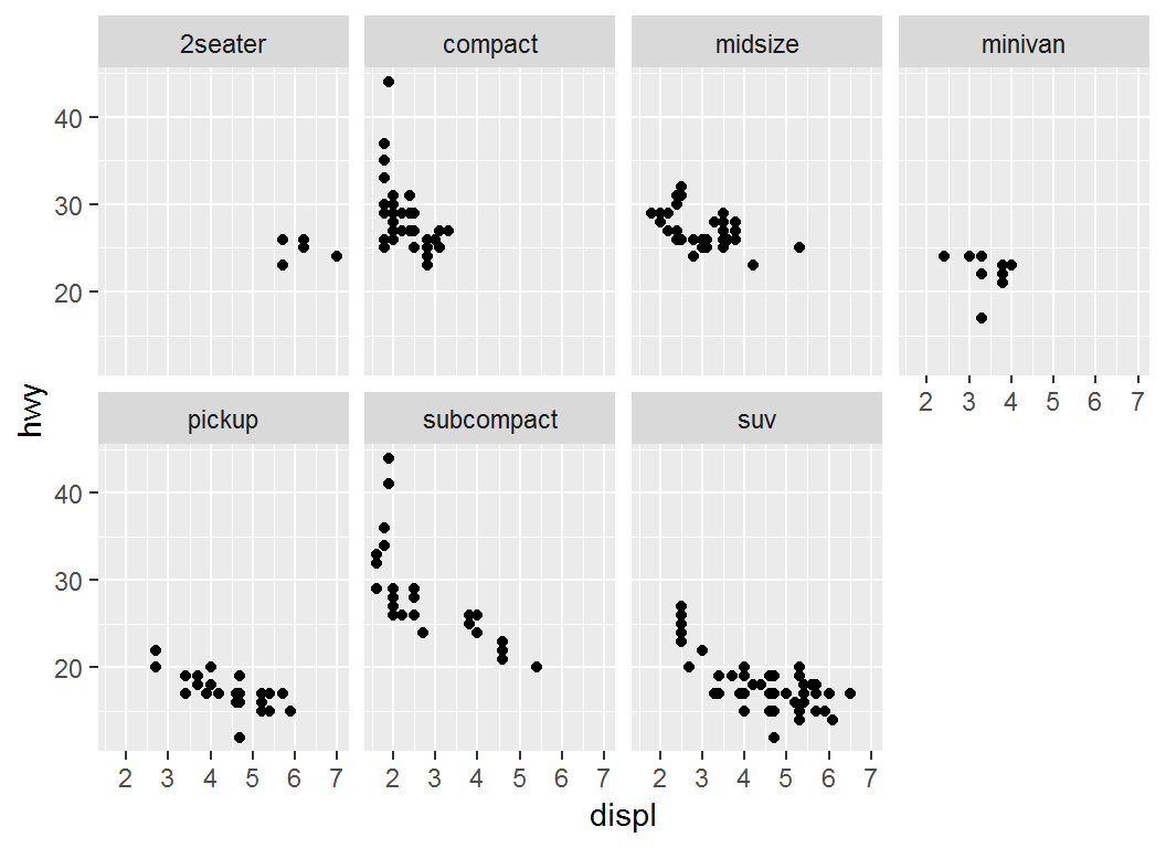
facet_wrap: illustration
> p1 + facet_wrap(vars(class), nrow = 2) 
> # Same as: p1 + facet_wrap(~class, nrow = 2)facet_wrap: illustration
Plot displ versus hwy for each level of class via faceting with columnwise layout:
> p1= ggplot(data = mpg)+
+   geom_point(mapping = aes(x = displ, y = hwy))
>
> p2a = p1 + facet_wrap(vars(class), ncol = 3)- note the use of
var(class), equivalent to~class;classhas 7 levels ncolspecifies in how many columns the plots should be displayed
facet_wrap: illustration
> p2a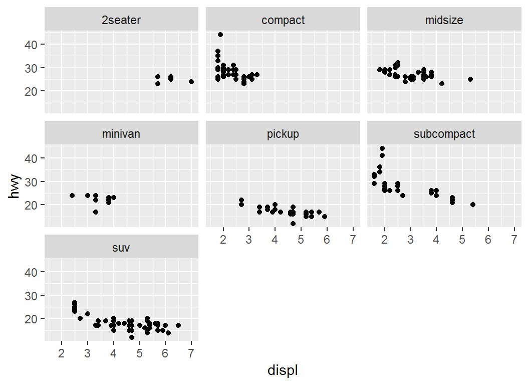
facet_wrap: illustration
> # Plot `displ` versus `hwy`, faceting via `cyl` and `drv`
> ggplot(mpg,aes(x=displ,y=hwy))+geom_point()+
+ facet_wrap(cyl~drv)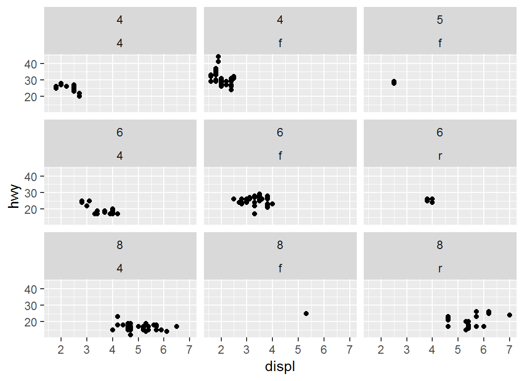
Faceting: facet_grid
facet_grid forms a matrix of panels defined by row and column faceting variables. Basic syntax:
facet_grid(rows = NULL, cols = NULL,
scales = "fixed",labeller = "label_value")rows(orcols): variables that define faceting groups on the row (or column) dimensionrows = NULL, cols = NULLtakes the form ofvariable1 ~ variable2,.~ variable2orvariable1 ~.Use
?facet_gridto obtain details
Facet grid via column variable
Plot displ versus hwy, faceting with drv columnwise:
> p1+ facet_grid(. ~ drv)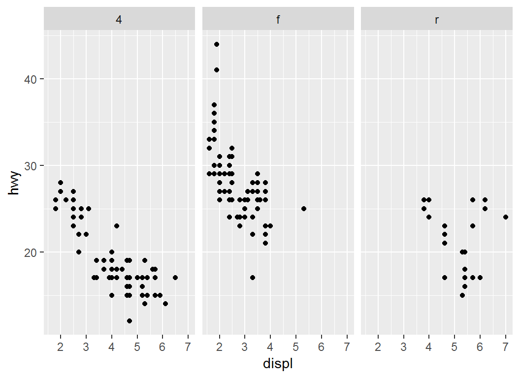
Facet grid via row variable
Plot displ versus hwy, faceting with drv rowwise:
> p1+ facet_grid(drv ~ .)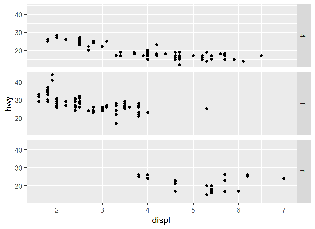
Facet grid with two variables
Plot displ versus hwy, faceting with drv and cyl:
> p1+ facet_grid(drv ~ cyl)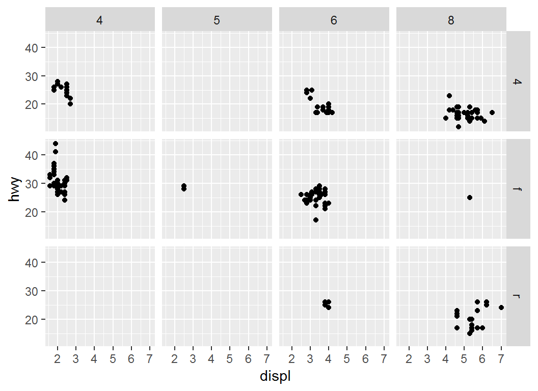
Visualization with >=3 factors
Recap on mpg data set:
# A tibble: 6 x 6
  manufacturer displ class   drv     cyl   hwy
  <fct>        <dbl> <fct>   <fct> <int> <int>
1 audi           1.8 compact f         4    29
2 audi           1.8 compact f         4    29
3 audi           2   compact f         4    31
4 audi           2   compact f         4    30
5 audi           2.8 compact f         6    26
6 audi           2.8 compact f         6    26
Visualization with >=3 factors
Plot displ versus hwy, faceting with drv and cyl, coloring points by class, assigning shapes by manufacturer ( chevrolet or toyota):
> mpg1 = mpg %>%
+   filter(manufacturer %in% c("chevrolet","toyota"))
>
> p1c = ggplot(mpg1, aes(x = displ, y = hwy))+theme_bw()+
+   geom_point(aes(colour=class,shape=manufacturer))+
+   facet_grid(drv~cyl)
Note: in mpg1, a combination of distinct levels or values of class, manufacturer, drv, and cyl may not have any observation
Visualization with >=3 factors
> p1c 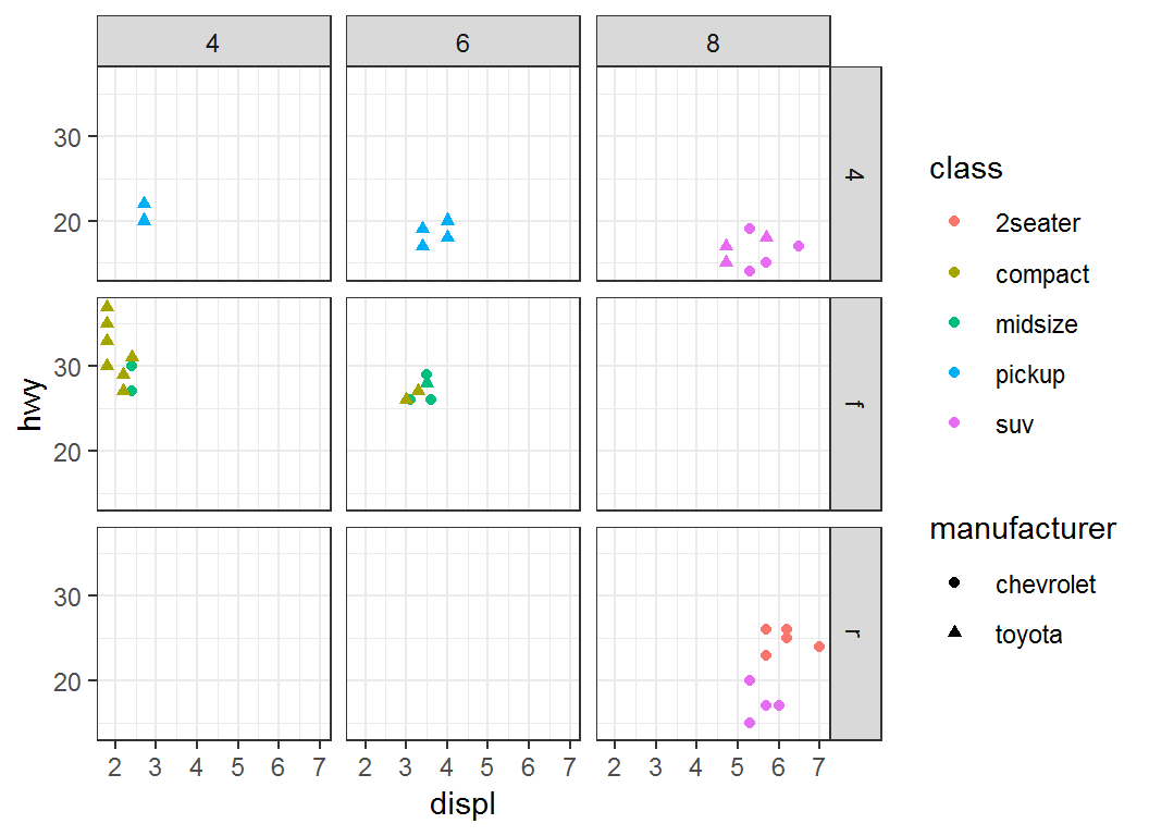
Annotating a plot: Part I
Two commands for annotation
Sometimes one would like to annotate a plot to make it more informative. There are two commands for this purpose:
geom_text()adds text directly to a plotgeom_label()draws a rectangle around text
Syntax for commands
Basic syntax:
geom_text(mapping = NULL, data = NULL,
  parse=FALSE, inherit.aes = TRUE)

geom_label(mapping = NULL, data = NULL,
parse=FALSE, inherit.aes = TRUE)mapping: set of aesthetic mappings created byaes(); if specified andinherit.aes = TRUE(the default),mappingis combined with the default mapping at the top level of the plotmappingmust be supplied if there is no plot mapping
Syntax for commands
Basic syntax (continued):
data: data to be displayed in this layer; ifNULL, the default, data are inherited from the plot data as specified in the call toggplot()parse: ifTRUE, labels will (often) be parsed into (math) expressions;FALSEby default
Use ?geom_text and geom_label to get more information
Recap on mpg data set
> head(mpg %>% select(class,drv,cyl,hwy))
# A tibble: 6 x 4
  class   drv     cyl   hwy
  <fct>   <fct> <int> <int>
1 compact f         4    29
2 compact f         4    29
3 compact f         4    31
4 compact f         4    30
5 compact f         6    26
6 compact f         6    26
> levels(mpg$drv)
[1] "4" "f" "r"
> unique(mpg$cyl)
[1] 4 6 8 5
> levels(mpg$class)
[1] "2seater"    "compact"    "midsize"    "minivan"
[5] "pickup" "subcompact" "suv" geom_label: illustration
Plot displ vs hwy and annotate each pair of observations from “(displ,hwy)” by cyl type
> # build base layer
> p = ggplot(mpg,aes(displ,hwy))
>
> # add label via `cyl`; "label" is an aesthetic
> p1 = p +geom_label(aes(label=cyl),nudge_x = 0.05)
>
> # `nudge_x` horizontally adjusts labels to offset
> # text from points- note the use of
aes(label=cyl)ingeom_label,aes(displ,hwy)inggplot, and non-existence ofgeom_...forggplot nudge_y: vertically adjusts labels
geom_label: illustration
> p1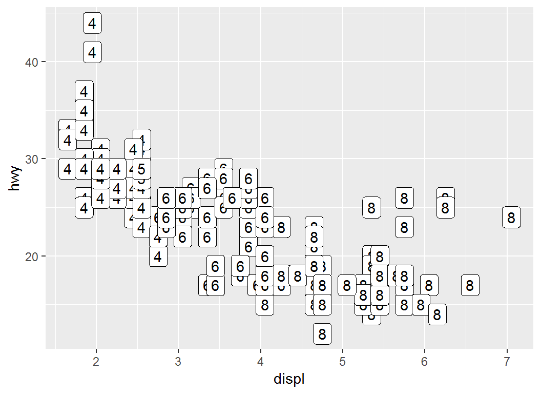
geom_label: illustration
> # Color `label` via `class`
> p+geom_label(aes(label=cyl,color = class))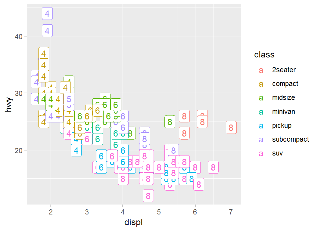
geom_text: illustration
Plot displ vs hwy and annotate each pair of observations from “(displ,hwy)” by cyl type
> q = ggplot(mpg,aes(displ,hwy))+geom_text(aes(label=cyl))- note the use of
aes(label=cyl)ingeom_text,aes(displ,hwy)inggplot, and non-existence ofgeom_...forggplot compare the above command with
ggplot(mpg,aes(displ,hwy))+geom_label(aes(label=cyl))
geom_text: illustration
> q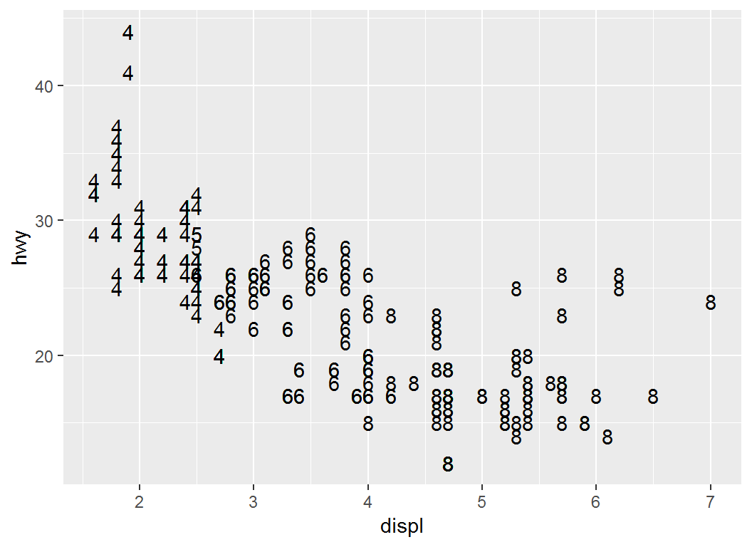
geom_text: illustration
> # Color `label` by `class`
> ggplot(mpg,aes(displ,hwy))+
+   geom_text(aes(label=cyl,colour = class))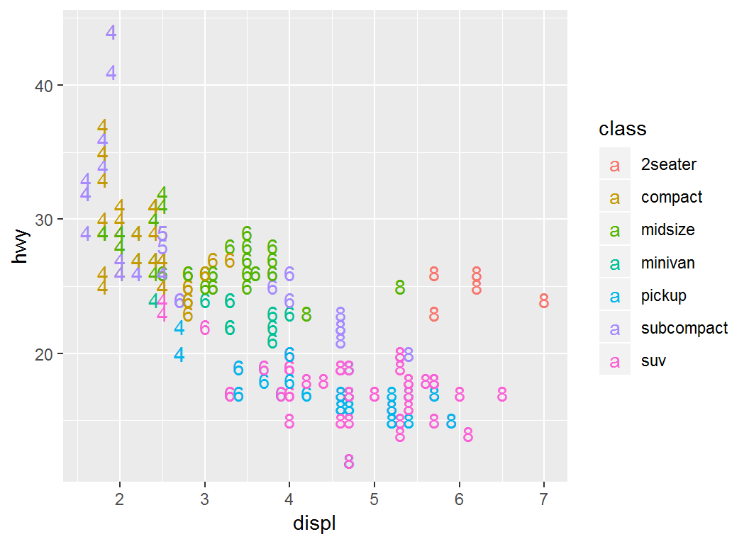
Annotating a plot: Part II
The command annotate
annotate adds geometric objects to a plot. But unlike a typical geom function, properties of the geometric objects are not mapped from variables of a data frame. Instead, they are passed in as vectors.
This is useful for adding small annotations (such as text labels), or if data in vectors instead of data frame need to be added.
The command annotate
Basic syntax:
annotate(geom, x = NULL, y = NULL,xmin = NULL, xmax = NULL,
ymin = NULL, ymax = NULL)geom: name of object to use for annotation, such as “text” or “segment”x,y,xmin,ymin,xmax,ymax: positioning aesthetics, at least one of which must be specified
Use ?annotate to get more information on annotate
The command annotate
For annotating using text, use the following:
annotate("text",x=NULL,y=NULL,label=NULL)for which the lengths of
x,yandlabelmust be compatibleFor annotating using a rectangle, use the following:
annotate("rect", xmin = NULL, xmax = NULL,
   ymin = NULL, ymax = NULL)
There are other choices as annotations, use
?annotationto get more information
annotate: illustration
Plot displ vs hwy and add annotation “Some text”:
> # create base layer
> p = ggplot(mpg, aes(x = displ, y = hwy)) + geom_point()
>
>
> # add annotation "Some text" at positions
> #(2,25), (3,25), (4,25) and (5,25)
> p1 = p + annotate("text", x = 2:5, y = 25,
+ label = "Some text")- note the existence of
geom_point()forggplot x = 2:5, y = 25give labels positions (2,25), (3,25), (4,25) and (5,25) in coordinates
annotate: illustration
> p1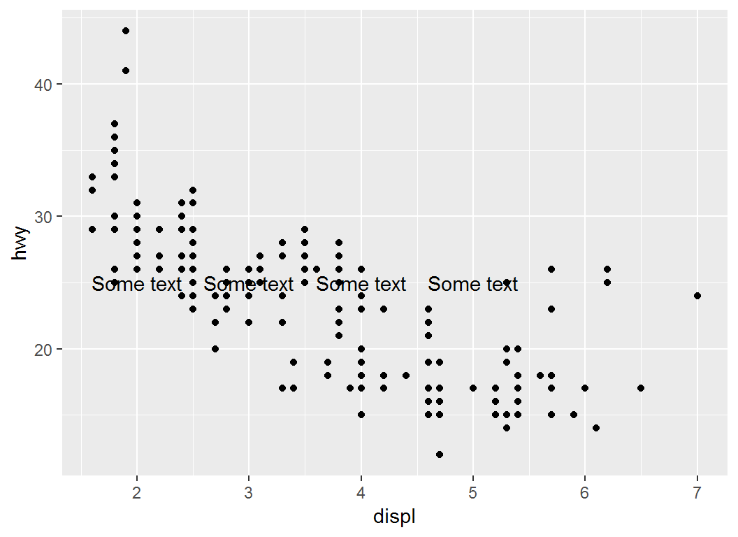
annotate: illustration
Plot displ vs hwy and add rectangle as annotation:
> # add a rectangle via "rect" whose size is determined
> # by `xmin`, `xmax`, `ymin` and `ymax`
>
> p2 = p + annotate("rect", xmin = 3, xmax = 4.2,
+         ymin = 12, ymax = 21, alpha = .2)
>
> # `alpha` controls the degree of transparency of
> # annotation; it can also control the transparency
> # of ggplot2 geometric objectsannotate: illustration
> p2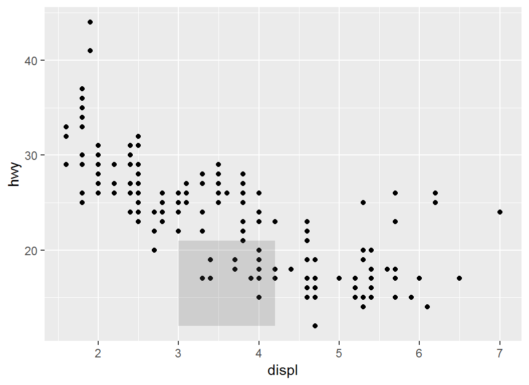
annotate: illustration
Plot displ vs hwy and add a math expression as annotation:
> p2 = p + annotate("text", x = 4, y = 40,
+                   label = "italic(R) ^ 2 == 0.75",
+                   parse = TRUE)
>
> # `parse` converts the string "italic(R) ^ 2 == 0.75" into
> # a mathematical expression using latex syntax;- “italic(R) ^ 2 == 0.75” is equivalent to \(R^{2}=0.75\)
italic(R)sets the font of “R” to be italic;^2sets2as superscriptx = 4, y = 40sets the position of annotation at coordinates (4,40)
annotate: illustration
> p2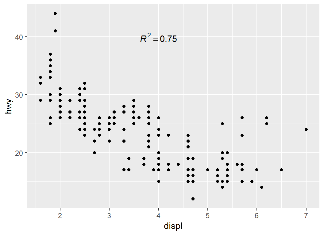
License and session Information
> sessionInfo()
R version 3.5.0 (2018-04-23)
Platform: x86_64-w64-mingw32/x64 (64-bit)
Running under: Windows 7 x64 (build 7601) Service Pack 1

Matrix products: default

locale:
[1] LC_COLLATE=English_United States.1252
[2] LC_CTYPE=English_United States.1252
[3] LC_MONETARY=English_United States.1252
[4] LC_NUMERIC=C
[5] LC_TIME=English_United States.1252

attached base packages:
[1] stats     graphics  grDevices utils     datasets  methods
[7] base

other attached packages:
[1] ggplot2_3.1.0 knitr_1.21

loaded via a namespace (and not attached):
 [1] Rcpp_1.0.0       rstudioapi_0.8   bindr_0.1.1
 [4] magrittr_1.5     tidyselect_0.2.5 munsell_0.5.0
 [7] colorspace_1.3-2 R6_2.3.0         rlang_0.3.0.1
[10] dplyr_0.7.8      stringr_1.3.1    plyr_1.8.4
[13] tools_3.5.0      revealjs_0.9     grid_3.5.0
[16] gtable_0.2.0     xfun_0.4         withr_2.1.2
[19] htmltools_0.3.6  assertthat_0.2.0 yaml_2.2.0
[22] lazyeval_0.2.1   digest_0.6.18    tibble_1.4.2
[25] crayon_1.3.4     bindrcpp_0.2.2   purrr_0.2.5
[28] glue_1.3.0       evaluate_0.12    rmarkdown_1.11
[31] labeling_0.3     stringi_1.2.4    compiler_3.5.0
[34] pillar_1.3.1     scales_1.0.0     pkgconfig_2.0.2