Set ranges for an axis
# set ranges for both x-axis and y-axis
lims(...)

# set range for x-axis
xlim(...)

# set range for y-axis
ylim(...)
Base plot
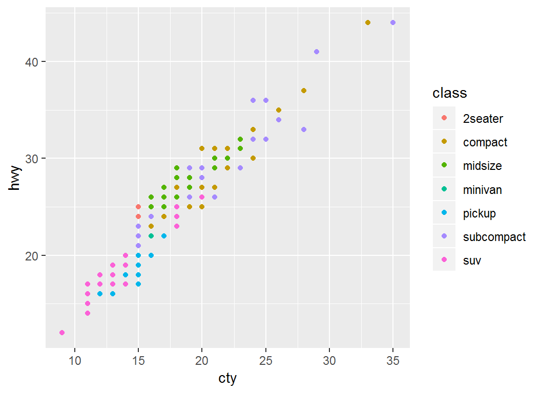
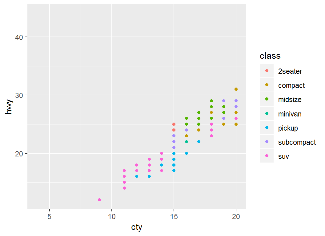
Plot cty (mpg in city) vs hwy (mpg on highway):
> p =ggplot(mpg)+geom_point(aes(x=cty,y=hwy,color=class)); p
Set range for x-axis
> p + xlim(c(4,20))
> # use xlim(c(NA,20)) to set an automatic lower limit
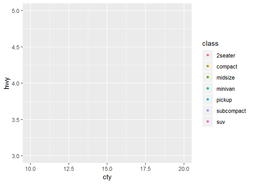
Set range for both axes
> p + lims(x = c(10, 20), y = c(3, 5))
scale_*_continuous
scale_x_continuous (or scale_y_continuous) controls the x (or y) axis for continuous variables, and often sets breaks, labels, na.value, and/or trans:
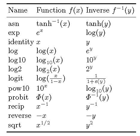
breaks: a numeric vector of tick positionslabels: a character vector giving labels (must be same length as breaks)na.value=value: missing values are set as valuetrans: transformations such as scale_*_log10(), scale_*_sqrt() and scale_*_reverse()
Illustration: base plot
> # Plot `displ` vs `hwy`:
> p1 = ggplot(mpg, aes(displ,hwy)) + geom_point(); p1
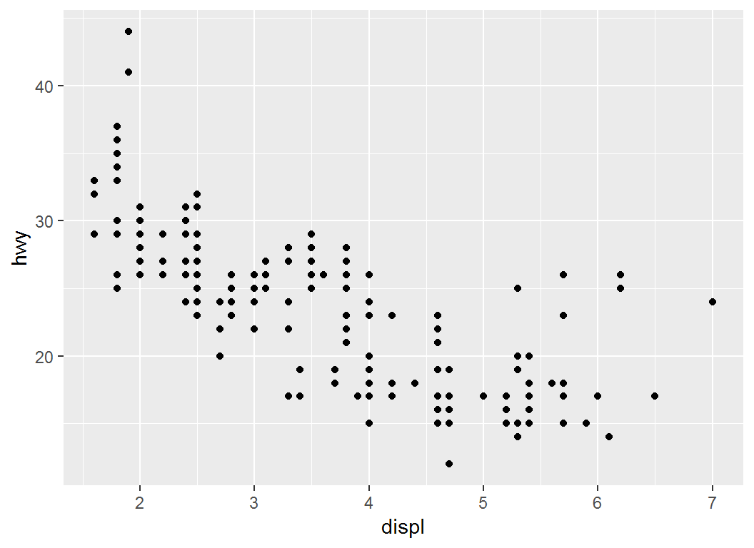
Illustration: breaks
> #  choose where the x-axis ticks appear
> p1 + scale_x_continuous(breaks = c(2, 4, 6))
Illustration: label
> #  personalized labels for ticks at specified positions
> p1 + scale_x_continuous(breaks = c(2, 4, 6),
+   label = c("two", "four", "six"))
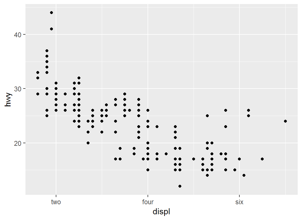
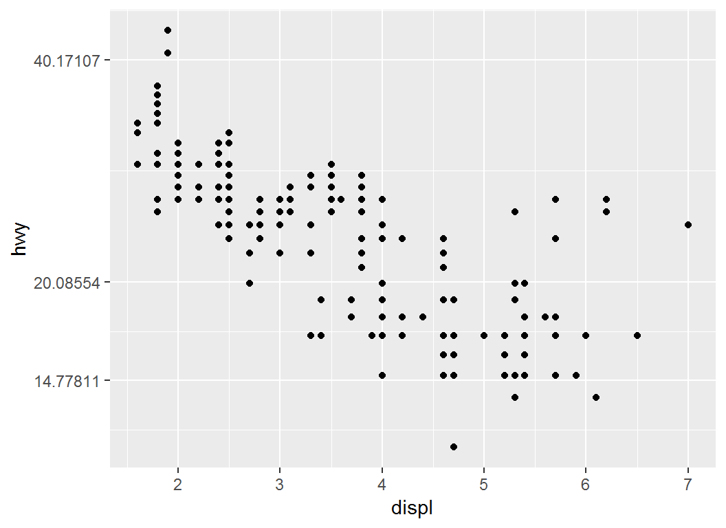
Illustration: trans
> # y-axis on natural logarithmic scale via `trans=log`
> p1 + scale_y_continuous(trans = "log")
trans: options
Table 6.2 from book “ggplot2”
scale_*_discrete
scale_x_discrete (or scale_y_discrete):
- controls the
x (or y) axis for discrete variables
- is often used to set
breaks, labels, na.value, and/or trans.
- has syntax and usage similar to those of
scale_x_continuous (and scale_y_continuous)
Illustration
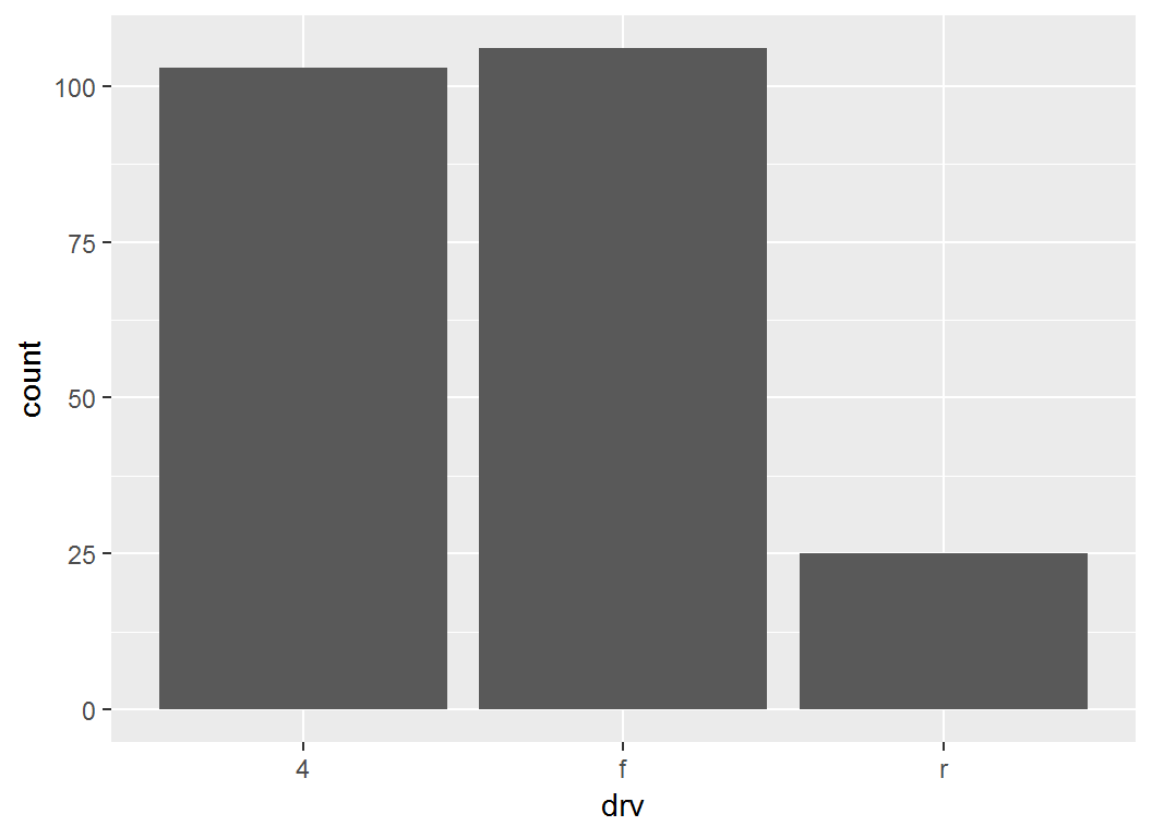
Base layer: bar plot for drv:
> p = ggplot(mpg, aes(x = drv)) + geom_bar(); p
Illustration
> # re-label x-axis ticks
> p + scale_x_discrete(labels =
+     c("4 wheel drive", "front drive", "rear drive"))

Colour scales for continuous variables
Overview
After position, probably the most commonly used aesthetic is colour. For this aesthetic and continuous variables, there are three methods, based on their gradient schemes:
scale_*_gradient()scale_*_gradient2()scale_*_gradientn())
Note: colour is exchangeable with color
Method I: Two-colour gradient
scale_colour_gradient() and scale_fill_gradient():
- each being a two-colour gradient “low-high”, i.e., with a low end and a high end
- arguments
low (for “low end” ) and high (for “high end”) control the colours at the low end and high end of the gradient, respectively
Method II: Diverging-colour gradient
scale_colour_gradient2() and scale_fill_gradient2():
- each being a three-colour gradient “low-mid-high”, i.e., with a low, mid, and high end
- each having a
mid colour for the colour of midpoint
midpoint defaults to \(0\) but can be set to any value
These two functions are particularly useful for creating diverging colour schemes
Method III: n-colour gradient
scale_colour_gradientn() and scale_fill_gradientn():
- each being a custom
n-colour gradient
- each requiring a vector of colours in the
colours argument; by default, these colours will be evenly spaced along the range of the data
Illustration
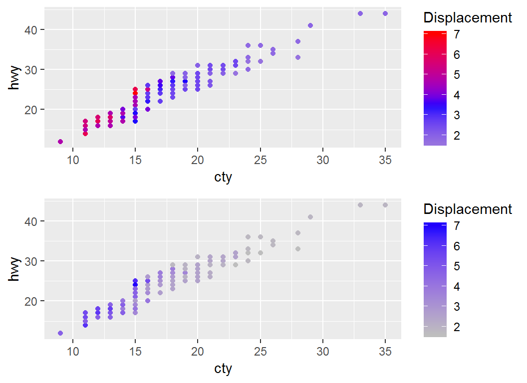
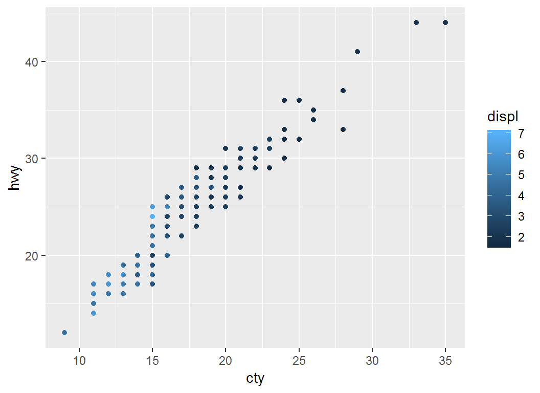
> # Plot `cty` vs `hwy` with default scheme `color=displ`
> p = ggplot(mpg)+geom_point(aes(cty,hwy,color=displ))
> p  # note legend title "displ""
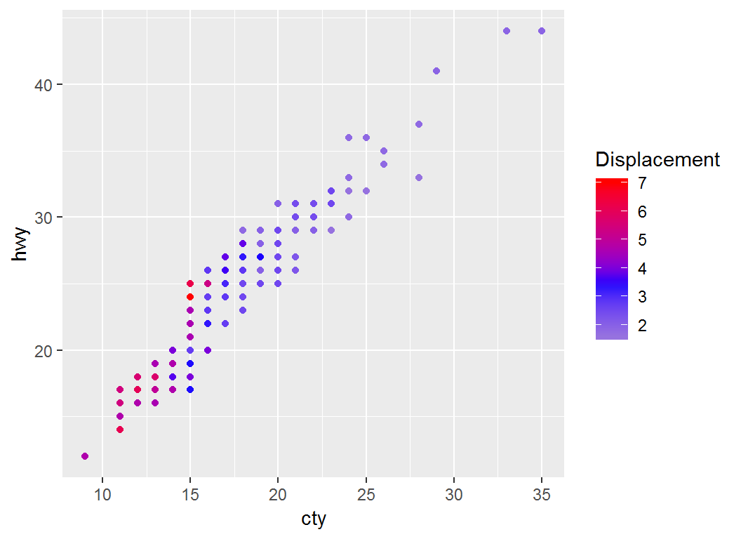
Adjust coloring: low-mid-high
> p2a1=p + scale_colour_gradient2("Displacement",low="gray",
+       mid="blue",high="red",midpoint=mean(mpg$displ))
> p2a1 # note legend title "Displacement" and `midpoint`
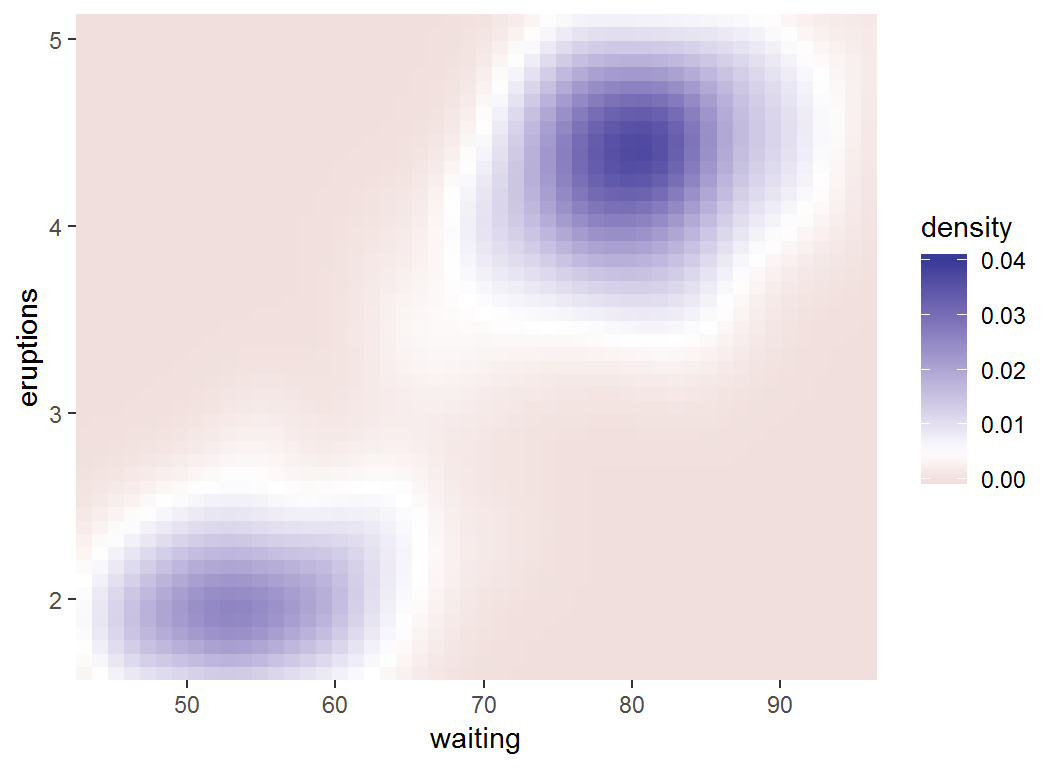
Visualise 3D surfaces in 2D
The faithful dataset (in library MASS) records waiting times (waiting) between eruptions and eruption times in minutes eruption for the Old Faithful geyser in Yellowstone Park:
> library(MASS); head(faithful)
  eruptions waiting
1     3.600      79
2     1.800      54
3     3.333      74
4     2.283      62
5     4.533      85
6     2.883      55
Density function \(z=f(x,y)\) for \((x,y)\)=(eruptions,waiting) can be visualized via 2D contours
Obtain estimated density
Obtain density estimate for (eruptions,waiting):
- load library
MASS; apply kde2d, i.e., 2D kernel density estimation, to faithful data set
- data frame “f2d” has 3 columns x, y and z, where z is the value of the estimated density evaluated at (x,y)
> f2d <- with(faithful, MASS::kde2d(eruptions, waiting,
+ h = c(1, 10), n = 50))
> df <- with(f2d, cbind(expand.grid(x, y), as.vector(z)))
> names(df) <- c("eruptions", "waiting", "density")
> head(df)
  eruptions waiting     density
1  1.600000      43 0.003216159
2  1.671429      43 0.004146406
3  1.742857      43 0.004987802
4  1.814286      43 0.005611508
5  1.885714      43 0.005921813
6  1.957143      43 0.005882327
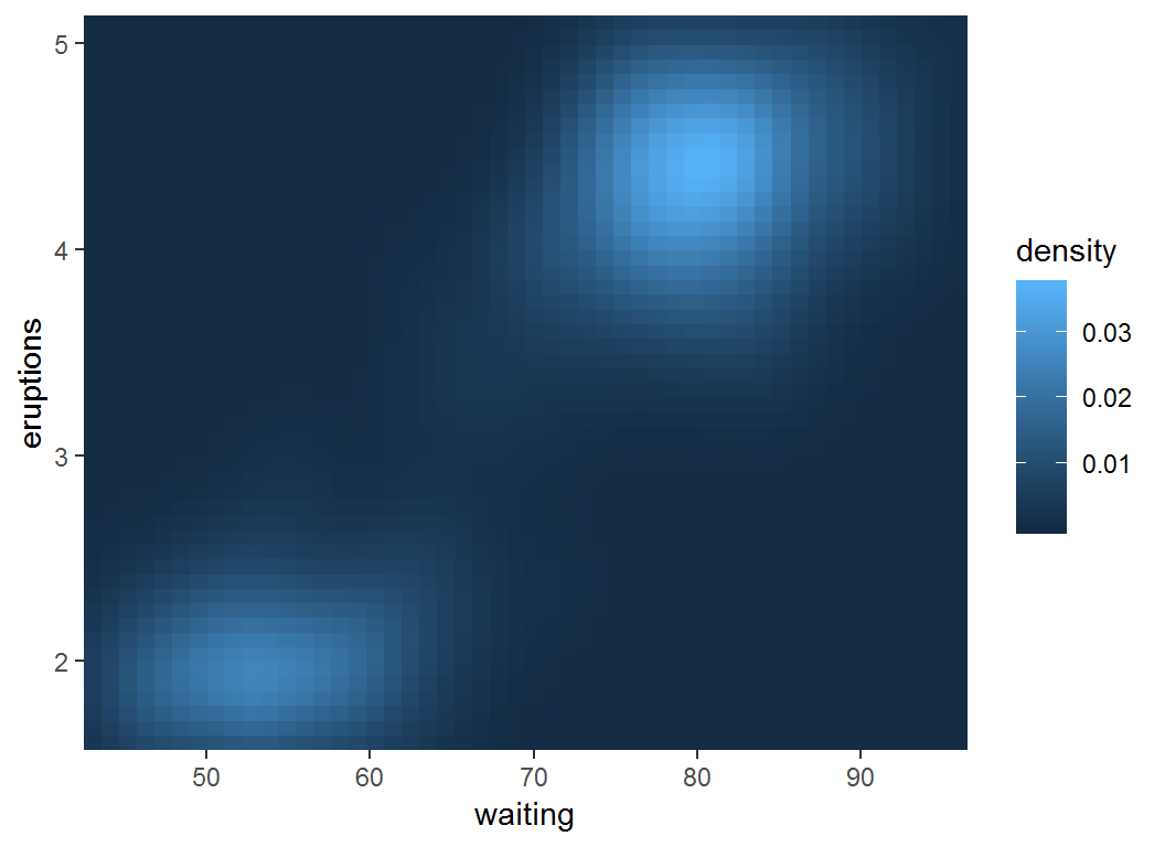
Visualize density estimate
> erupt <- ggplot(df,aes(waiting,eruptions,fill = density))+
+     geom_tile()+
+    scale_x_continuous(expand = c(0, 0))+
+    scale_y_continuous(expand = c(0, 0))
Note the use of
geom_tile() and fill = densityscale_*_continuous(expand = c(0, 0))
Visualize density estimate
> erupt #max(df$density)=0.037, min(df$density)=10^(-24)
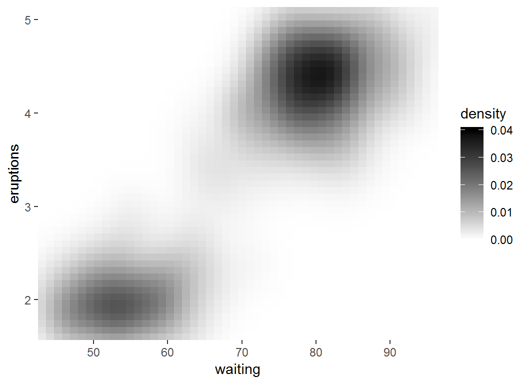
Adjust coloring: low-high
> # `limits = c(0, 0.04)` sets range for values in legend
> erupt + scale_fill_gradient(limits = c(0,0.04),
+ low = "white", high = "black")
Adjust coloring: low-mid-high
> erupt + scale_fill_gradient2(limits = c(0, 0.04),
+ midpoint = mean(df$density))
Color scales for discrete variables
Overview
Two methods for colour scales for discrete data:
- choosing evenly spaced colors frm the color wheel (via, e.g.,
scale_colour_hue()); scale_colour_hue() works well for up to about eight colours
- selecting colors from hand-picked sets (via , e.g.,
RColorBrewer)
Popular palettes of RColorBrewer are “Set1” and “Dark2” for points and “Set2”, “Pastel1”, “Pastel2” and “Accent” for areas. RColorBrewer::display.brewer.all() lists all palettes.
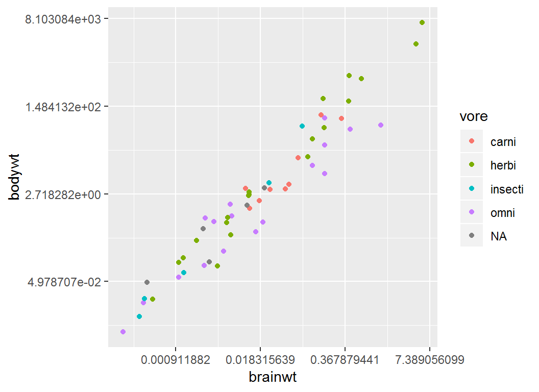
Illustration
Part of msleep data set (from library ggplot2):
# A tibble: 6 x 3
   brainwt  bodywt vore
     <dbl>   <dbl> <chr>
1 NA        50     carni
2  0.0155    0.48  omni
3 NA         1.35  herbi
4  0.00029   0.019 omni
5  0.423   600     herbi
6 NA         3.85  herbi
brainwt (brain weight in kilograms); bodywt (body weight in kilograms); vore (carnivore, omnivore or herbivore)
Illustration
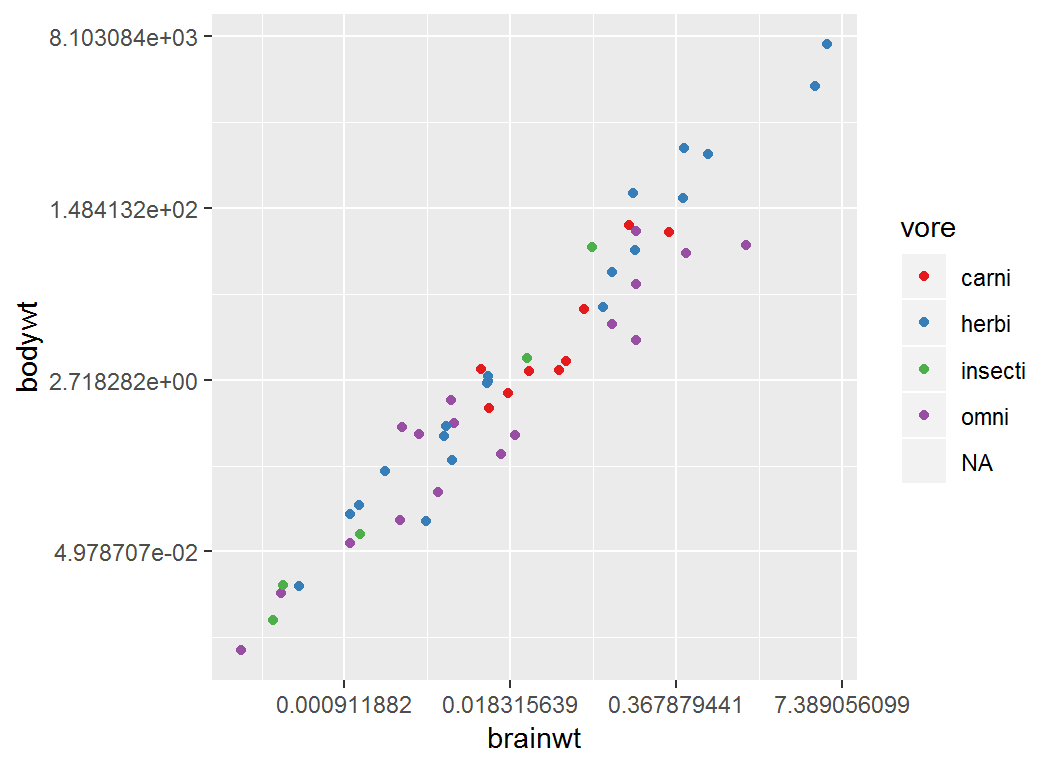
Plot brainwt vs bodywt and color “point” by vore:
> p4 = ggplot(msleep)+
+   geom_point(aes(brainwt,bodywt,colour = vore))+
+   scale_x_continuous(trans="log")+
+   scale_y_continuous(trans="log")
Note: both axes on nautral logarithmic scale
Illustration
> p4
Adjust coloring by brewer
> p4 + scale_colour_brewer(palette = "Set1")