Stat 437 Lecture Notes 2d
Xiongzhi Chen
Washington State University
Other visualization techniques
Overview
We will cover
- Visualizing data with geographical information
- Visualizing network data
- Visualizing tree-like structures
- Dynamic visualization
The contents are gathered from online resources.
R packages Needed
The R packages we will discuss:
Visualization via ggmap
Overview
Some data (e.g., car accidents, insurance claims, transmission of infectious disease) often contain geographical information, and visualizing such data over a map can be quite informative.
The R package
ggmapallows an overlay of geometric objects on maps, where locations are identified by their latitudes and longitudes. Details on how to useggmapcan be found at https://github.com/dkahle/ggmapggmapuses Google maps. However, Google has recently changed its API requirements, and ggmap users are now required to register with Google (and possibly pay a fee for using Google’s maps beyond a quota)
Illustration: background
This example is borrowed from https://blog.dominodatalab.com/geographic-visualization-with-rs-ggmaps/.
- The dataset can be downloaded from https://app.dominodatalab.com/u/seanlorenz/ggmap-demo/view/data/vehicle-accidents.csv. It contains accidents caused by motor vehicles
MV.Numberand by non-motor vehiclesNM.Numberfor 50 US states.
We will visualize MV.Number for 48 states (excluding Alaska and Hawaii) via ggmap.
Data set at a glance
- Read data from local drive; make sure variables have correct object types
- Remove observations for Alaska and Hawaii (due to US map properties)
> mydata = read.csv("vehicle-accidents.csv")
> mydata$State <- as.character(mydata$State)
> mydata$MV.Number = as.numeric(mydata$MV.Number)
> library(dplyr)
> mydata = mydata %>%
+   filter(State !="Alaska" & State !="Hawaii")
> head(mydata %>% select(State,MV.Number))
        State MV.Number
1     Alabama        78
2     Arizona       145
3    Arkansas        46
4  California       722
5    Colorado        77
6 Connecticut        40
Obtain latitudes and longitudes
- Load library
ggmap - Obtain latitudes and longitudes for each state in data set (registration with Google is needed for this purpose)
- Create a data frame that has the latitudes and longitudes
> library(ggmap)
> for (i in 1:nrow(mydata)) {
+   latlon = geocode(mydata[i,1])
+   mydata$lon[i] = as.numeric(latlon[1])
+   mydata$lat[i] = as.numeric(latlon[2])
+ }
> mv_num_collisions = data.frame(mydata$MV.Number,
+               mydata$lon,mydata$lat,mydata$State)
> colnames(mv_num_collisions) = c('MV.Number',
+               'lon','lat','State')
View latitudes and longitudes
Longitudes (lon) and latitudes (lat) for some states:
  MV.Number        lon      lat       State
1        78  -86.75026 32.75041     Alabama
2       145 -111.50098 34.50030     Arizona
3        46  -91.55780 33.98174    Arkansas
4       722 -118.02135 35.12562  California
5        77 -105.50083 39.00027    Colorado
6        40  -72.66648 41.66704 Connecticut
Obtain US map and plot data
- Obtain US map by specifying map range and map type
circle_scale_amtsets scaling parameter for the circles to be overlayed on mapscale_size_continuous(range=NULL)specifies the minimum and maximum sizes of plotting symbol (“circle” in this example) after transformationslabs(x = "",y=""): no labels for axes
> us <- c(left = -125, bottom = 25.75, right = -67, top = 49)
> map <- get_stamenmap(us, zoom = 5, maptype = "toner-lite")
> circle_scale_amt <- 0.05
> ggmap(map)+geom_point(aes(x=lon,y=lat),
+ data=mv_num_collisions,col="orange", alpha=0.4,
+ size=mv_num_collisions$MV.Number*circle_scale_amt)+
+ scale_size_continuous(range=
+ range(mv_num_collisions$MV.Number))+
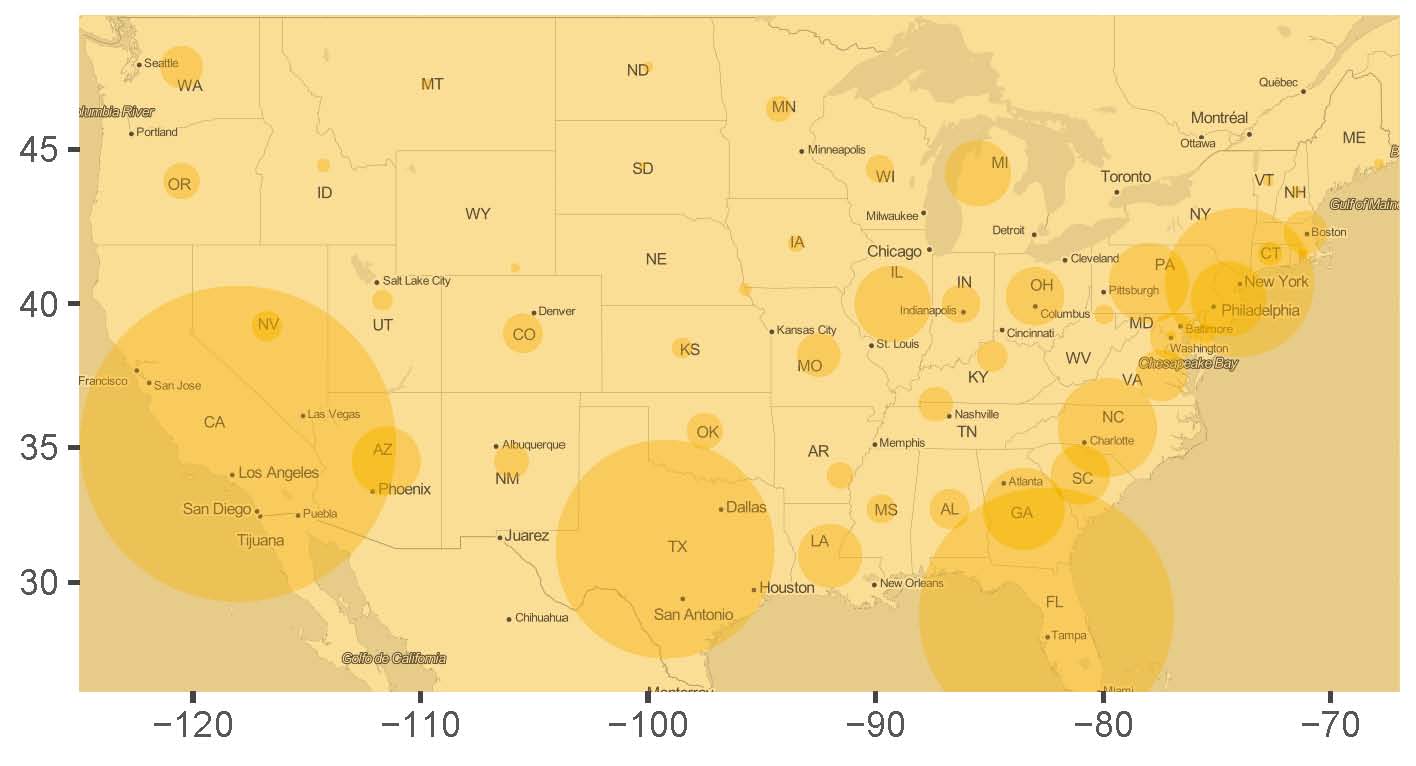
+ labs(x = "",y="")Visualization with overlay
- The larger the circle, the higher the accident rate/number
- East coast states more accidents than northwest states
Visualizing with igraph
Overview
Binary relationships, such as interactions between two individuals, a disease transmitting between two subjects, and reaction between two chemicals, among subjects or objects can be represented as networks (and equivalently as graphs).
- Each “subject” in a network is represented by a “node” or “vertex” in a graph
- Each “interaction” or “relationship” between two subjects or objects in a network is represented by an “edge” between their associated nodes in a graph
Overview
For networks or graphs, we often are interested in
if a network or graph can be split into smaller sub-networks or sub-graphs such that on average there are more connections between the nodes in each sub-network than there are connections between sub-networks
if a node in a graph has many more connections with other nodes than does any other node.
The R package igraph creates graphs as representations of networks.
Illustration: background
Materials to be presented are adopted from http://kateto.net/network-visualization.
- The data set contains relationships among several medias. Among the medias, if one is referenced by another, either by
mentionorhyperlink, then the corresponding two medias are “connected” and there is an edge between them - Relationships among the medias will be represented as a graph, where a media is a “node”, and a relationship (i.e., reference by
mentionorhyperlink) is an “edge”
A look at the dataset
Load “nodes” and “links” (as edges):
> nodes <- read.csv("Dataset1-Media-Example-NODES.csv",
+                   header=T, as.is=T)
> links <- read.csv("Dataset1-Media-Example-EDGES.csv",
+                   header=T, as.is=T)
> head(nodes)
id media media.type type.label audience.size
1 s01 NY Times 1 Newspaper 20
2 s02 Washington Post 1 Newspaper 25
3 s03 Wall Street Journal 1 Newspaper 30
4 s04 USA Today 1 Newspaper 32
5 s05 LA Times 1 Newspaper 20
6 s06 New York Post 1 Newspaper 50
> head(links)
from to type weight
1 s01 s02 hyperlink 22
2 s01 s03 hyperlink 22
3 s01 s04 hyperlink 21
4 s01 s15 mention 20
5 s02 s01 hyperlink 23
6 s02 s03 hyperlink 21Create an igraph object
directed=Tcreates a directed graph (to emphasize “media A” is referenced by “media B”)- Note
d=links,vertices=nodesand “media” innet
> library(igraph)
> net=graph_from_data_frame(d=links,vertices=nodes,directed=T)
> net
IGRAPH d4cf23c DNW- 17 49 --
+ attr: name (v/c), media (v/c), media.type (v/n),
| type.label (v/c), audience.size (v/n), type (e/c),
| weight (e/n)
+ edges from d4cf23c (vertex names):
 [1] s01->s02 s01->s03 s01->s04 s01->s15 s02->s01 s02->s03
 [7] s02->s09 s02->s10 s03->s01 s03->s04 s03->s05 s03->s08
[13] s03->s10 s03->s11 s03->s12 s04->s03 s04->s06 s04->s11
[19] s04->s12 s04->s17 s05->s01 s05->s02 s05->s09 s05->s15
[25] s06->s06 s06->s16 s06->s17 s07->s03 s07->s08 s07->s10
[31] s07->s14 s08->s03 s08->s07 s08->s09 s09->s10 s10->s03
+ ... omitted several edges
Create a graph
Two sub-networks; Wall Street Journal (has the most edges)
> # remove multiple edges and loops
> net1=simplify(net,remove.multiple=T,remove.loops=T)
> # add "vertex.label" and specify label color
> plot(net1, edge.arrow.size=.4, edge.color="blue",
+     vertex.label=V(net)$media, vertex.label.color="black")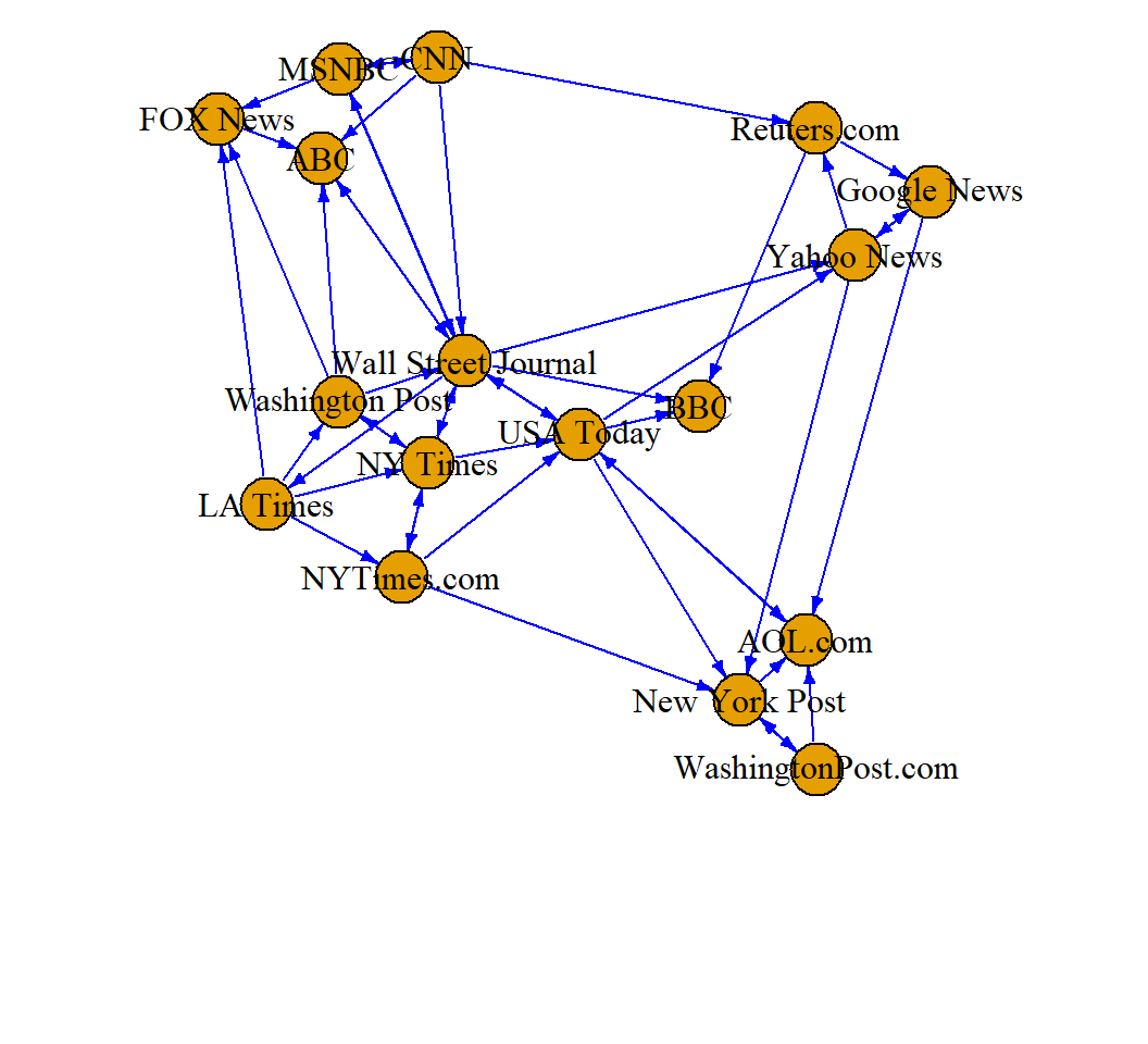
Visualization via ggdendro
Overview
[From wiki] A dendrogram is a diagram representing a tree.
- In hierarchical clustering, it illustrates the arrangement of the clusters produced by some analyses
- In decision making, it illustrates the decisions to be made under different situations
- In phylogenetics, it displays the evolutionary relationships among various biological taxa. In this case, the dendrogram is also called a “phylogenetic tree”
The R package ggdendro creates dendrograms.
Illustration: background
The USArrests data set (included in the library ‘ggdendro’) contains arrests per 100,000 residents in each of the 50 US states in 1973:
- Arrests for 3 types of crimes:
Murder,Assault,Rape UrbanPop(percent of population living in urban areas)
> library(ggplot2); library(ggdendro); head(USArrests)
           Murder Assault UrbanPop Rape
Alabama      13.2     236       58 21.2
Alaska       10.0     263       48 44.5
Arizona       8.1     294       80 31.0
Arkansas      8.8     190       50 19.5
California    9.0     276       91 40.6
Colorado      7.9     204       78 38.7
We will classify (or cluster) states based on the 4 features (and the Euclidean distance).
Create a dendrogram
Dendrogram suggests 2 large clusters or 4 smaller clusters
> hc <- hclust(dist(USArrests), "ave")  # clustering
> ggdendrogram(hc, rotate = TRUE) # rotate by 90 degrees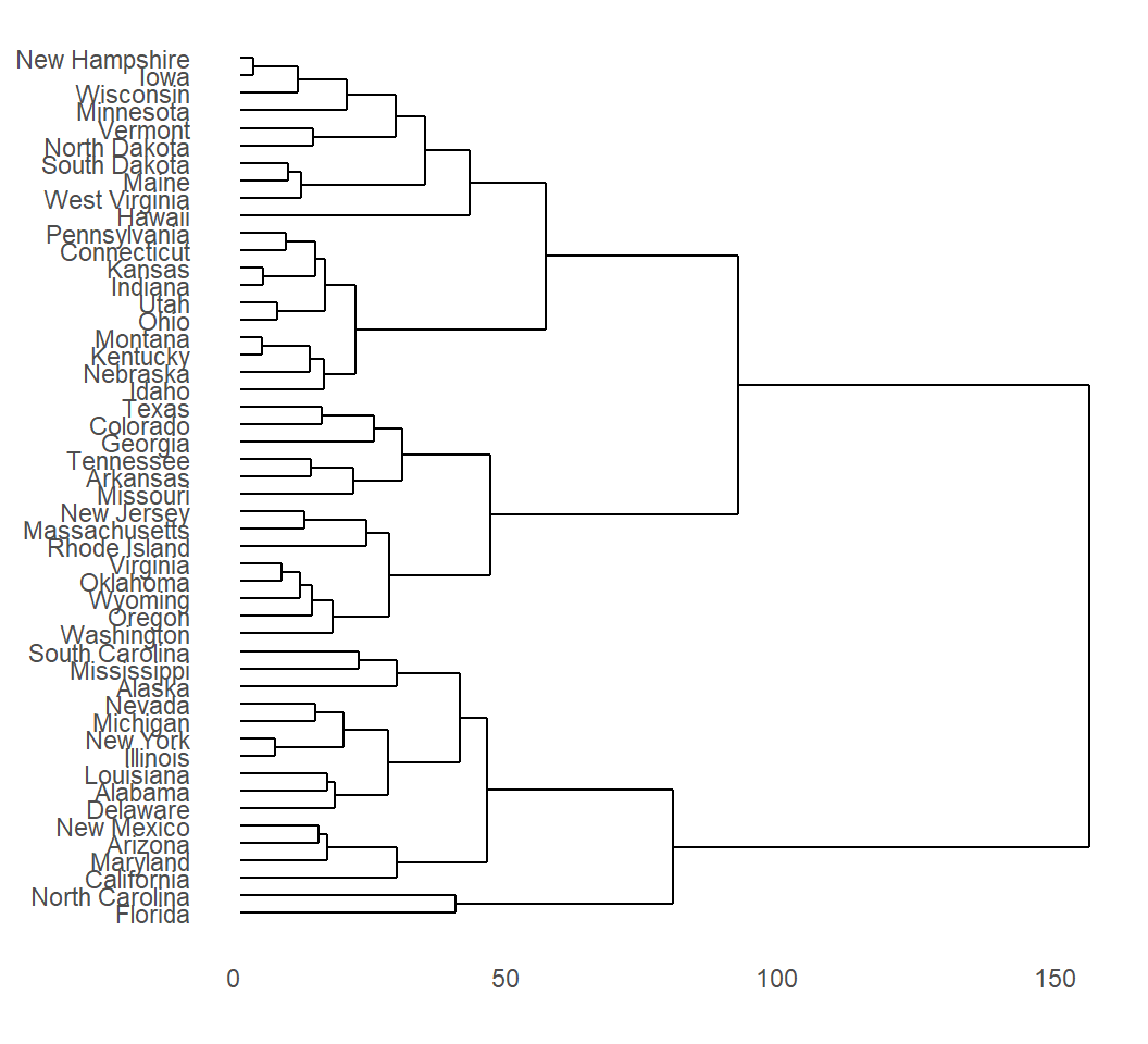
License and session Information
> sessionInfo()
R version 3.5.0 (2018-04-23)
Platform: x86_64-w64-mingw32/x64 (64-bit)
Running under: Windows 10 x64 (build 18362)

Matrix products: default

locale:
[1] LC_COLLATE=English_United States.1252
[2] LC_CTYPE=English_United States.1252
[3] LC_MONETARY=English_United States.1252
[4] LC_NUMERIC=C
[5] LC_TIME=English_United States.1252

attached base packages:
[1] stats     graphics  grDevices utils     datasets  methods
[7] base

other attached packages:
[1] knitr_1.29

loaded via a namespace (and not attached):
 [1] compiler_3.5.0  magrittr_1.5    tools_3.5.0
 [4] htmltools_0.5.0 revealjs_0.9    yaml_2.2.1
 [7] stringi_1.4.6   rmarkdown_1.11  highr_0.8
[10] stringr_1.4.0   xfun_0.15       digest_0.6.25
[13] rlang_0.4.6     evaluate_0.14