Stat 437 Lecture Notes 2e
Xiongzhi Chen
Washington State University
Interactive and dynamic visualizations
Overview
- Interactive visualization allows a user to interact with the resulting plot (e.g., plot shows data information when a user hovers his/her mouse on the plot)
- Dynamic visualization usually presents relationships between specific features of data as other features vary (e.g., “Life expectancy” vs “GDP per capita” across different “Year”s)
- R package
plotlyfor interactive visualization/plots, andgganimatefor dynamic visualization/plots
Overview
Interactive and dynamic visualizations are better presented via html files than pdf files.
To take a screenshot of a plotly interactive plot (so that the screenshot can be embebbed in a pdf file), we can use library webshot and program phantomjs, which can be installed by running in R/R Studio console:
install.packages("webshot")
webshot::install_phantomjs()
Visualization with plotly
Brief syntax for plotly
Brief syntax:
plot_ly(data = data.frame(), ..., type = NULL)type: a character string specifying the trace type (e.g. “scatter”, “bar”, “box”, etc)
Use ?plotly::plot_ly to get more information
Example 1: background
The “Iris” data set (included in the library plotly) gives measurements in centimeters of sepal length, sepal width, petal length, and petal width respectively, for 50 Iris flowers from each of 3 species of Iris, i.e., setosa, versicolor, and virginica.
> library(plotly)
> head(iris)
  Sepal.Length Sepal.Width Petal.Length Petal.Width Species
1          5.1         3.5          1.4         0.2  setosa
2          4.9         3.0          1.4         0.2  setosa
3          4.7         3.2          1.3         0.2  setosa
4          4.6         3.1          1.5         0.2  setosa
5          5.0         3.6          1.4         0.2  setosa
6          5.4         3.9          1.7         0.4  setosa
Example 1: plotting codes
Plot Petal.Length vs Petal.Width with color aesthetic
> library(plotly)
> # Caution: ~ is added before a variable name
> p = plot_ly(iris, x = ~Petal.Length, y = ~Petal.Width,
+         color = ~Species, type = "scatter") %>%
+    layout(xaxis=list(title="Petal Length"),
+          yaxis=list(title="Petal Width"))
> # center the plot in the output html file
> library(shiny); div(p)
type = "scatter"creates a scatter plot and is the default, and text information will appear on hover- Set x-axis label as
L1and y-axis label asL2via
layout(xaxis=list(title="L1"),yaxis=list(title="L2"))Example 1: the plot
Example 2: background
The midwest data set (included in the library plotly) contains demographic information of midwest counties
> library(plotly); library(dplyr)
> head(midwest %>% select(percollege,state) %>% data.frame())
  percollege state
1   19.63139    IL
2   11.24331    IL
3   17.03382    IL
4   17.27895    IL
5   14.47600    IL
6   18.90462    IL
> unique(midwest$state)
[1] "IL" "IN" "MI" "OH" "WI"percollegeis “the percent of population who are college educated in astate”; use?midwestto get more information on dataset
Example 2: plotting codes
Create boxplot for percollege with color aesthetic (via state)
> library(plotly)
> p1= plot_ly(midwest, x= ~percollege, color= ~state,
+              type= "box") %>%
+   layout(xaxis=list(title="Percent of population
+                     with college education"))
type = "box"creates boxplot, and text information will appear on hoverlayout(xaxis=list(title="my label")): set x-axis label tomy label
Example 2: the plot
Example 2: save the plot
Save the interactive plot as an html file:
> library(htmlwidgets)
> htmlwidgets::saveWidget(p1, file = "InteractivePlot2.html")
Visualization with gganimate
Illustration: background
The gapminder data set (included in the library gapminder) contains information on lifeExp (life expectancy), pop (population), and gdpPercap (GDP per capita) across years and for different countries (country)
> library(ggplot2)
> library(gapminder); head(gapminder)
# A tibble: 6 x 6
  country     continent  year lifeExp      pop gdpPercap
  <fct>       <fct>     <int>   <dbl>    <int>     <dbl>
1 Afghanistan Asia       1952    28.8  8425333      779.
2 Afghanistan Asia       1957    30.3  9240934      821.
3 Afghanistan Asia       1962    32.0 10267083      853.
4 Afghanistan Asia       1967    34.0 11537966      836.
5 Afghanistan Asia       1972    36.1 13079460      740.
6 Afghanistan Asia       1977    38.4 14880372      786.
> unique(gapminder$year)
 [1] 1952 1957 1962 1967 1972 1977 1982 1987 1992 1997 2002
[12] 2007
Illustration: static visualization
Plot lifeExp (life expectancy) vs gdpPercap (GDP per capita) with size and colour aesthetics
> p = ggplot(gapminder,
+   aes(x=gdpPercap, y=lifeExp, size=pop, colour=country))+
+   geom_point(show.legend = FALSE)+
+   scale_color_viridis_d()+ scale_size(range = c(2, 12))+
+ # minimum and maximum sizes of plotting symbol "circle"
+   # transform scale for x-axis
+ scale_x_log10()+labs(x="GDP per capita",y="Life expectancy")
geom_point(show.legend = FALSE)is recommended since there are a lot of countriesscale_colour_viridis_dis theviridiscolor scales, designed to be perceived by viewers with common forms of colour blindness
Illustration: static visualization
> p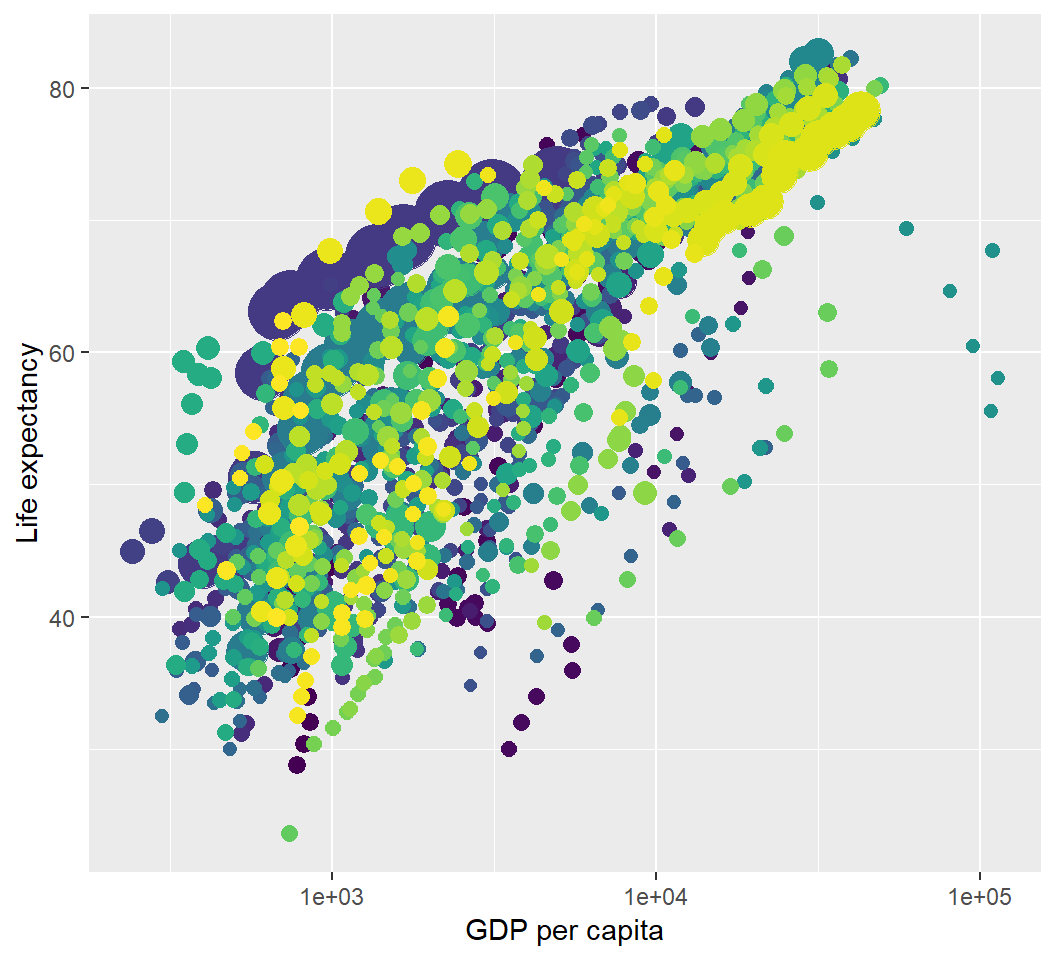
Illustration: dynamic visualization
> library(gganimate)
> library(gifski) # visualization as gif in pdf output
> p2=p+transition_time(year)+labs(title="Year:{frame_time}");p2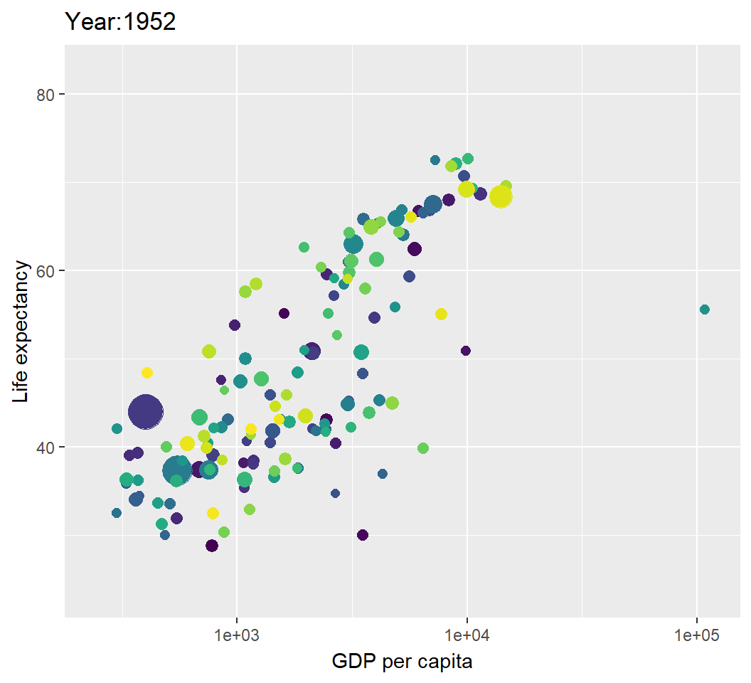
Illustration: save the animation
Save the dynamic visualization (shown as animation) as a gif file:
> animate(p2, fps = 10, width = 750, height = 450)
> anim_save("MyAnimation.gif")
License and session Information
> sessionInfo()
R version 3.5.0 (2018-04-23)
Platform: x86_64-w64-mingw32/x64 (64-bit)
Running under: Windows 10 x64 (build 19041)

Matrix products: default

locale:
[1] LC_COLLATE=English_United States.1252
[2] LC_CTYPE=English_United States.1252
[3] LC_MONETARY=English_United States.1252
[4] LC_NUMERIC=C
[5] LC_TIME=English_United States.1252

attached base packages:
[1] stats     graphics  grDevices utils     datasets  methods
[7] base

other attached packages:
 [1] htmlwidgets_1.3 dplyr_0.7.8     gifski_0.8.6
 [4] gganimate_1.0.3 gapminder_0.3.0 bindrcpp_0.2.2
 [7] shiny_1.2.0     webshot_0.5.1   plotly_4.8.0
[10] ggplot2_3.1.0   knitr_1.21

loaded via a namespace (and not attached):
 [1] progress_1.2.0     revealjs_0.9       tidyselect_0.2.5
 [4] xfun_0.4           purrr_0.2.5        colorspace_1.3-2
 [7] htmltools_0.3.6    viridisLite_0.3.0  yaml_2.2.0
[10] utf8_1.1.4         rlang_0.3.0.1      pillar_1.3.1
[13] later_0.7.5        glue_1.3.0         withr_2.1.2
[16] tweenr_1.0.1       RColorBrewer_1.1-2 bindr_0.1.1
[19] plyr_1.8.4         stringr_1.3.1      munsell_0.5.0
[22] gtable_0.2.0       codetools_0.2-15   evaluate_0.12
[25] labeling_0.3       crosstalk_1.0.0    httpuv_1.4.5.1
[28] fansi_0.4.0        highr_0.7          Rcpp_1.0.0
[31] xtable_1.8-3       scales_1.0.0       promises_1.0.1
[34] jsonlite_1.6       farver_1.1.0       mime_0.6
[37] png_0.1-7          hms_0.4.2          digest_0.6.18
[40] stringi_1.2.4      grid_3.5.0         cli_1.0.1
[43] tools_3.5.0        magrittr_1.5       lazyeval_0.2.1
[46] tibble_1.4.2       crayon_1.3.4       tidyr_0.8.2
[49] pkgconfig_2.0.2    data.table_1.11.8  prettyunits_1.0.2
[52] assertthat_0.2.0   rmarkdown_1.11     httr_1.4.0
[55] rstudioapi_0.8     R6_2.3.0           compiler_3.5.0