Stat 437 Lecture Notes 5b
Xiongzhi Chen
Washington State University
2D density estimation and visualization, and plotting bivariate functions: software implementation
R software and commands
R commands and libraries needed:
- R library
mvtnormand commandrmvnorm{mvtnorm}to generate multivariate Gaussian (i.e., normal) observations - R library
MASSand commandkde2d{MASS}for 2D density estimation - R built-in command
perspto visualize 2D density function - R library
ggplot2and commandstat_density_2d{ggplot2}for contours of 2D density - R library
plot3Dand commandpersp3D{plot3D}for 3D plots
Command rmvnorm
rmvnorm{mvtnorm} is a random number generator for the multivariate normal distribution with mean vector mean and covariance matrix sigma. Its basic syntax is
rmvnorm(n, mean = rep(0, nrow(sigma)),
sigma = diag(length(mean)))n: number of observations.mean: mean vector; default isrep(0, nrow(sigma)).sigma: covariance matrix; default isdiag(length(mean)).
Command kde2d{MASS}
kde2d{MASS} implements two-dimensional kernel density estimation with an axis-aligned bivariate normal kernel, evaluated on a square grid. Its basic syntax is
kde2d(x, y, h, n = 25, lims = c(range(x), range(y)))xandy: x- and y-coordinate of data, respectively.h: vector of bandwidths for x and y directions. It defaults to normal reference bandwidth. A scalar value will be taken to apply to both directions.n: number of grid points in each direction. It can be scalar or a length-2 integer vectorc(n[1],n[2]).
Command kde2d{MASS}
Basic syntax:
kde2d(x, y, h, n = 25, lims = c(range(x), range(y)))lims: limits of the rectangle covered by the grid asc(xl, xu, yl, yu)
kde2d{MASS} returns a list of three components:
xandy: x and y coordinates of the grid points, as vectors of lengthn.z: ann[1]byn[2]matrix of the estimated density;z’s rows correspond to the value ofx, andz’s columns to the value ofy.
Command persp
persp{graphics} draws perspective plots of a surface over the x-y plane. persp is a generic function. Its basic syntax is
persp(z, xlab = NULL, ylab = NULL, zlab = NULL,
      main = NULL, sub = NULL,
      theta = 0, phi = 15, r = sqrt(3), d = 1,
col = "white",ticktype = "simple")z: a matrix containing the values to be plotted.xlab,ylab,zlab: titles for the axes. These must be character strings; expressions are not accepted.main,sub: main, sub title, as for axes title.
Command persp
Basic syntax:
persp(z, xlab = NULL, ylab = NULL, zlab = NULL,
      main = NULL, sub = NULL,
      theta = 0, phi = 15, r = sqrt(3), d = 1,
col = "white",ticktype = "simple")theta,phi: angles defining the viewing direction.thetagives the azimuthal direction, andphithe colatitude.r: distance of the eyepoint from the centre of the plotting box.d: a value which can be used to vary the strength of the perspective transformation. Values ofdgreater than 1 will lessen the perspective effect, and values less 1 will exaggerate it.
Command persp
Basic syntax:
persp(z, xlab = NULL, ylab = NULL, zlab = NULL,
      main = NULL, sub = NULL,
      theta = 0, phi = 15, r = sqrt(3), d = 1,
col = "white",ticktype = "simple")col: the color(s) of the surface facets. Transparent colours are ignored. This is recycled to the(nx-1)(ny-1)facets.ticktype: a character; its value “simple” draws just an arrow parallel to the axis to indicate direction of increase, whereas its value “detailed” draws normal ticks as per 2D plots.
stat_density_2d{ggplot2}
stat_density_2d{ggplot2} draws probability contours for a 2D density. Its basic syntax is
library(ggplot2)
ggplot(data, aes(x,y))+stat_density_2d(aes(fill = ..level..),
geom="polygon", colour="white")data,x,y:datais a “data.frame” or matrix that containsx,ycoordinate valueslevel: heights of contours, i.e., values of a densitystat_density_2d(aes(fill = ..level..): fill in plot with color gradient based onlevelgeom: curve type to be used to draw contourscolour: color of contours
Command persp3D{plot3D}
persp3D{plot3D} extends R’s persp function. Its basic syntax is
persp3D (x = seq(0, 1, length.out = nrow(z)),
       y = seq(0, 1, length.out = ncol(z)), z,
contour=FALSE, phi = 40, theta = 40)z: matrix (2-D) containing the values to be plotted as aperspplot.x,y: vectors or matrices with x and y values. If they are vectors, thenxshould be of length equal tonrow(z)andyshould be of length equal toncol(z). If they are matrices,xandyshould have the same dimension asz.
Command persp3D{plot3D}
Basic syntax:
persp3D (x = seq(0, 1, length.out = nrow(z)),
       y = seq(0, 1, length.out = ncol(z)), z,
contour=FALSE, phi = 40, theta = 40)theta,phi: angles defining the viewing direction.thetagives the azimuthal direction, andphithe colatitude, as inpersp.contour: logical; if it takes valueTRUE, a contour will be plotted at the bottom.
Note: plot3D also has command hist3D
2D density estimation and visualization, and plotting bivariate functions: illustrations
Gaussian mixture: K=3,p=2
Gaussian mixture for \(K=3\) classes and \(p=2\) features with
Class 1, 2 and 3 mixing proportions: \(\pi_1=0.4\), \(\pi_2=0.3\), \(\pi_3=0.3\)
Class 1, 2 and 3 components: \[f_1(x)\sim \text{Gaussian}(\mu_1=(0,0)^T,\Sigma_1=\mathbf{I}),\] \[f_2(x)\sim \text{Gaussian}\left(\mu_2=(-1,-1)^T,\Sigma_2=\left(\begin{array}{cc} 1 & 0.7\\ 0.7 & 1 \end{array}\right)\right)\] and \[f_3(x)\sim \text{Gaussian}\left(\mu_3=(1,1)^T,\Sigma_3=0.25\mathbf{I}\right)\]
marginal: \(f(x)= \sum_{k=1}^3 \pi_k f_k(x)\) (not Gaussian)
Generate data
Randomly generate \(n=10^5\) observations:
> set.seed(2)
> n=100000; cpb=c(0.4,0.3,0.3)
> clbs = sample(1:3,n,replace = T, prob=cpb)
> n1=length(clbs[clbs==1]); n2=length(clbs[clbs==2]);
> n3=length(clbs[clbs==3])
> library(mvtnorm)
> x1=rmvnorm(n1, mean=c(0,0), sigma=diag(2));
> Sg2= matrix(c(1,0.7,0.7,1),nrow=2);
> x2=rmvnorm(n2, mean=c(-1,-1), sigma=Sg2);
> x3=rmvnorm(n3, mean=c(1,1), sigma=0.25*diag(2))cpb: vector of mixing proportionsclbs= sample(1:3,n, replace=T, prob=cpb): class labels for observations in each classx1,x2,x3: matrices whose rows are observations from Class 1, 2, 3, respectively
Generate data
Create data.frame for observations:
> proportion = c(rep(cpb[1],n1),rep(cpb[2],n2),rep(cpb[3],n3))
> component=c(rep(1,n1),rep(2,n2),rep(3,n3))
> observation = rbind(x1,x2,x3)
> colnames(observation)=c("X1","X2")
> df1=data.frame(cbind(observation,proportion,component))
> cpStg=c(expression(f[1]),expression(f[2]),expression(f[3]))
> df1$component = factor(df1$component,labels=cpStg)
> df1[1,]
         X1         X2 proportion component
1 0.5158212 -0.1061886 0.4 f[1]cpStg: vector of math expressions \(f_1,f_2,f_3\)X1,X2: feature variables
Density estimation
> library(MASS)
> # extract obs. from each class
> df1a=df1[df1$component=="f[1]",]
> df1b=df1[df1$component=="f[2]",]
> df1c=df1[df1$component=="f[3]",]
> # 2D density estimate
> fde1 = with(df1a, MASS::kde2d(X1, X2, n = 50),
+  lims=c(min(df1a$X1),max(df1a$X1),min(df1a$X2),max(df1a$X2)))
> fde2 = with(df1b, MASS::kde2d(X1, X2, n = 50),
+  lims=c(min(df1b$X1),max(df1b$X1),min(df1b$X2),max(df1b$X2)))
> fde3 = with(df1c, MASS::kde2d(X1, X2, n = 50),
+ lims=c(min(df1c$X1),max(df1c$X1),min(df1c$X2),max(df1c$X2)))fde1,fde2,fde3: estimated 2D density for component \(f_1,f_2,f_3\), respectively- 2D density plot will be created using the
zcomponent offde1,fde2,fde3, respectively
Create color scheme
> # Color palette (100 colors)
> col.pal = colorRampPalette(c("yellow", "red"))
> colors = col.pal(100)
> # centers of surface facets
> nrz = ncz = 50
> z1.facet.center = (fde1$z[-1, -1] + fde1$z[-1, -ncz] +
+                   fde1$z[-nrz, -1] + fde1$z[-nrz, -ncz])/4
> # Range of colors
> z1.facet.range = cut(z1.facet.center, 100)
> # do the same for f2
> z2.facet.center = (fde2$z[-1, -1] + fde2$z[-1, -ncz] +
+                   fde2$z[-nrz, -1] + fde2$z[-nrz, -ncz])/4
> z2.facet.range = cut(z2.facet.center, 100)
> # do the same for f3
> z3.facet.center = (fde3$z[-1, -1] + fde3$z[-1, -ncz] +
+                  fde3$z[-nrz, -1] + fde3$z[-nrz, -ncz])/4
> z3.facet.range = cut(z3.facet.center, 100)*.facet.center: centers of surface facets for 2D density plot*.facet.range: range of colors
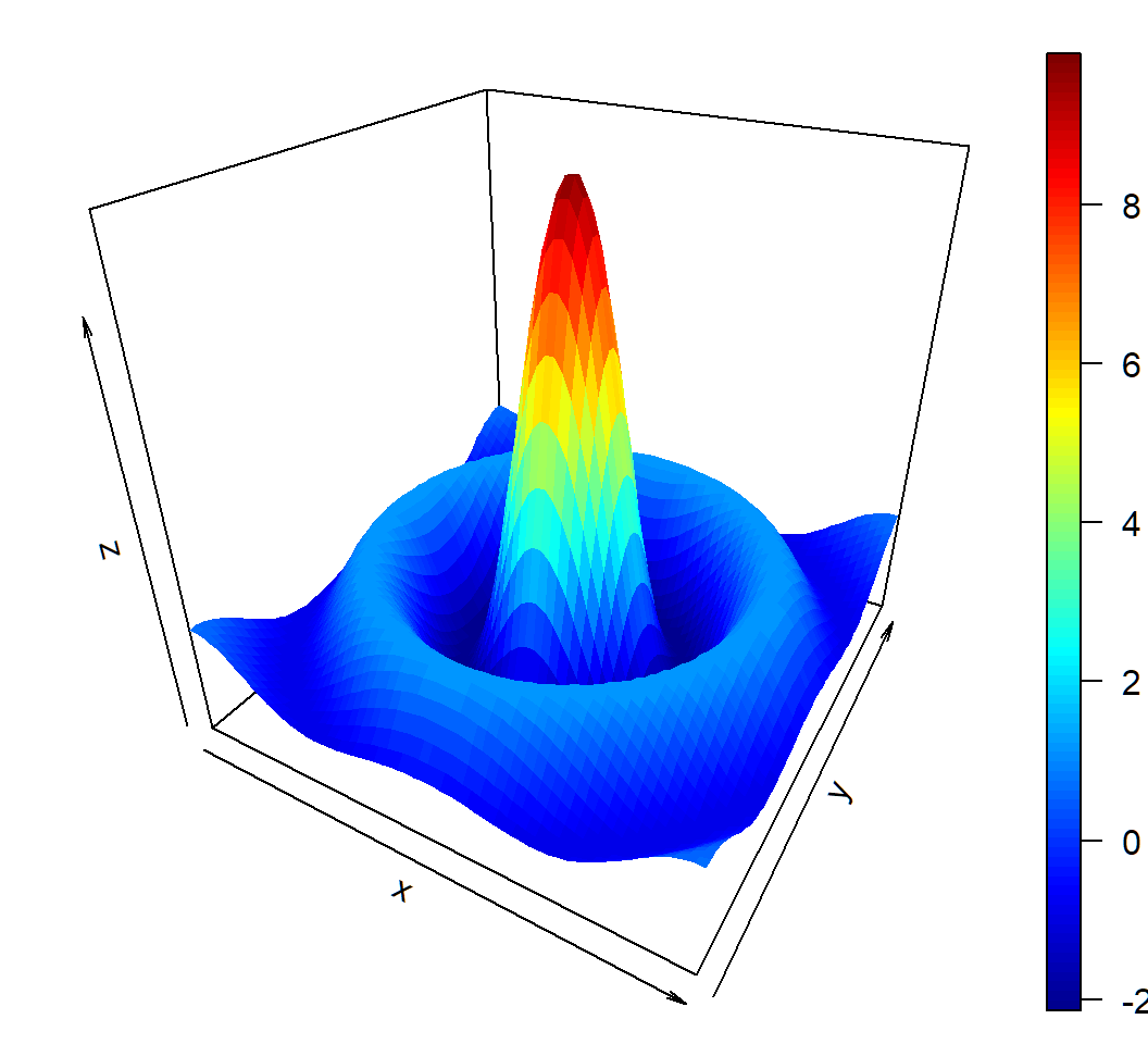
Create density plot
> par(mfrow=c(2,2),mar = c(.6,0.5,.8,.5),oma=c(.3,.3,.3,.3))
> persp(fde1,phi=30,theta=20,d=5,xlab="X1",ylab="X2",
+       zlab="density",main=expression(f[1]),r = sqrt(.5),
+       ticktype="detailed",col=colors[z1.facet.range])
> persp(fde2,phi=30,theta=20,d=5,xlab="X1",ylab="X2",
+       zlab="density",main=expression(f[2]),r = sqrt(0.5),
+       ticktype="detailed",col=colors[z2.facet.range])
> persp(fde3,phi=30,theta=20,d=5,xlab="X1",ylab="X2",
+       zlab="density",main=expression(f[2]),r = sqrt(0.5),
+ ticktype="detailed",col=colors[z2.facet.range])par(mfrow=...,mar=...,oma=...): set layout viamfrow, figure margins viamar, and outer marginsomamar = c(bottom, left, top, right)andoma = c(bottom, left, top, right)mfrow: vectorc(nr, nc). Subsequent figures will be drawn in annr-by-ncarray on the device by rows
3D plot of density
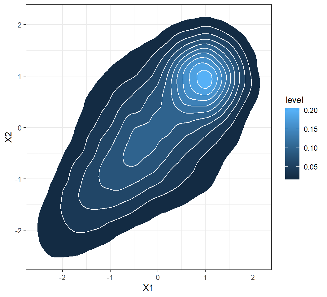
Contours of 2D density
> library(ggplot2)
> ggplot(df1, aes(X1, X2))+theme_bw()+
+   facet_grid(~component,labeller = label_parsed)+
+   stat_density_2d(aes(fill = ..level..),
+                   geom = "polygon", colour="white")+
+  theme(legend.position="top", legend.direction="horizontal")
labeller = label_parsed: show strip text (that in this example is designated bycomponentasf[1], etc) as math expression (\(f_1\), etc)
Contours of 2D density
Plot marginal density
> library(MASS)
> fde <- with(df1, MASS::kde2d(X1, X2, n = 50),
+   lims = c(min(df1$X1),max(df1$X1),min(df1$X2),max(df1$X2)))
> # create coloring scheme
> col.pal <- colorRampPalette(c("yellow", "red"))
> colors <- col.pal(100)
> nrz = ncz = 50
> z.facet.center <- (fde$z[-1, -1] + fde$z[-1, -ncz] +
+                 fde$z[-nrz, -1] + fde$z[-nrz, -ncz])/4
> z.facet.range <- cut(z.facet.center, 100)
> # create perspective plot
> par(mfrow=c(1,1),mar = c(.5,.5,.8,.5),oma=c(.3,.0,.3,.0))
> persp(fde, phi = 30, theta = 20, d = 5,xlab = "X1",
+       ylab = "X2",zlab="density",main=expression(f),
+ r=sqrt(.5),ticktype="detailed",col=colors[z.facet.range]) - same coding strategy and commands as for component densities
- almost the same codes as for component densities
Marginal density: 3D plot
Obtain contours of marginal
> library(ggplot2)
> ggplot(df1, aes(X1, X2))+theme_bw()+
+   stat_density_2d(aes(fill = ..level..),
+ geom = "polygon", colour="white")- same coding strategy and commands as for component densities
- almost the same codes as for component densities
Marginal density: contours
A bivariate function
Function \[ z = f(x,y) = 10 \times \frac{\sin \left(\sqrt{x^2+y^2}\right)}{\sqrt{x^2+y^2}} \] on \[ D = \{(x,y): -10 \le x \le 10, -10 \le y \le10\} \]
Note: \[f(0,0):=\lim_{x \to 0,y \to 0}f(x,y)=10\] since \(\lim_{t \to 0} (\sin t)/t=1\)
3D plot of bivariate function
> library(plot3D)
> # range of values for x and y
> # range is discretized
> y <- x <- seq(-10, 10, length=60)
> # create function f(x,y)
> f <- function(x,y) { r <- sqrt(x^2+y^2); 10 * sin(r)/r }
> # evaluate f on grid x \otimes y
> z <- outer(x, y, f)
> # create plot
> persp3D(x, y, z, theta = 30, phi = 30)outeris a very useful command; its basic syntax isouter(X, Y, FUN = "*", ...)z[i,j]\(= f(\tilde{x}_i,\tilde{y}_j)\) for \((\tilde{x}_i,\tilde{y}_j)\) in the 60-by-60 grid
3D plot of bivariate function
Discriminant analysis: software implementation
R software and commands
R commands and libraries needed:
- R library
MASS, commandlda{MASS}for LDA, and commandqda{MASS}for QDA - R command
predict{MASS}to classify observations using results fromldaorqda - R library
ROCRto create ROC curve
Command lda{MASS}
lda{MASS} implements linear discriminant analysis. Its basic syntax is
lda(formula, data, ..., subset, na.action)formula: of the formgroups ~ x1 + x2 + ..., i.e., the response is the grouping factor and the right hand side specifies the (non-factor) discriminators.data: data frame from which variables specified informulaare preferentially to be taken.subset: an index vector specifying the cases to be used in the training sample. (NOTE: If given, this argument must be named.)
Command lda{MASS}
Basic syntax:
lda(formula, data, ..., subset, na.action)na.action: a function to specify the action to be taken if NAs are found. The default action is for the procedure to fail. An alternative isna.omit, which leads to rejection of cases with missing values on any required variable. (NOTE: If given, this argument must be named.)
lda{MASS} returns an object of class lda containing the following components:
prior: the prior probabilities used.means: the group means.
Command qda{MASS}
qda{MASS} implements quadratic discriminant analysis. Its basic syntax is
qda(formula, data, ..., subset, na.action)- all arguments are the same as those for
lda
qda{MASS} returns an object of class qda containing the same components as the return of lda{MASS}
Command predict{MASS}
predict{MASS} has 2 versions: MASS::predict.lda for classification using lda and MASS::predict.qda for classification using qda. Its basic syntax is
predict(object, newdata, prior = object$prior, dimen,
method = c("plug-in", "predictive", "debiased"), ...)object: object of classldaorqdanewdata: data frame of cases to be classified or, ifobjecthas a formula, a data frame with columns of the same names as the variables used. A vector will be interpreted as a row vector. Ifnewdatais missing, an attempt will be made to retrieve the data used to fit theldaorqdaobject.
Command predict{MASS}
Basic syntax:
predict(object, newdata, prior = object$prior, dimen,
method = c("plug-in", "predictive", "debiased"), ...)prior: prior probabilities of the classes, which by default are the proportions in the training set or what was set in the call tolda.method: this determines how the parameter estimation is handled. With “plug-in” (the default) the usual unbiased parameter estimates are used and assumed to be correct. With “debiased” an unbiased estimator of the log posterior probabilities is used, and with “predictive” the parameter estimates are integrated out using a vague prior.
Command predict{MASS}
Basic syntax:
predict(object, newdata, prior = object$prior, dimen,
        method = c("plug-in", "predictive", "debiased"), ...)
predict{MASS} returns a list with components:
class: the MAP (i.e., “Maximum a posteriori”) classification (a factor). Namely, an observation \(x\) is assigned to class \(g\) if \(\Pr(Y=g|X=x)\) is the largest among \(\Pr(Y=k|X=x),k\in \mathcal{G}\)posterior: posterior probabilities for classes.
Command predict{MASS}
Basic syntax:
predict(object, newdata, prior = object$prior, dimen,
method = c("plug-in", "predictive", "debiased"), ...)- The returned
posterioris ann-by-\(K\) matrix, where \(K\) is the number of classes andnis the number of observations innewdata; column \(k\) ofposteriorcontains the posterior probability of an observation belonging to Class \(k\), where ordering of class labels is determined by R
Cmd prediction{ROCR}
prediction{ROCR} creates a prediction object. This function is used to transform the input data (which can be in vector, matrix, data.frame, or list form) into a standardized format. Its basic syntax is
prediction(predictions, labels)predictions: avector,matrix,data.frame, orlistcontaining the predictions.labels: avector,matrix,data.frame, orlistcontaining the true class labels; it must have the same dimensions aspredictions.
Cmd performance{ROCR}
performance{ROCR} creates performance objects that contain several kinds of predictor evaluations. Its basic syntax is
performance(prediction.obj, measure, x.measure="cutoff")prediction.obj: an object of classprediction.measure: performance measure to use for the evaluation. A complete list of the performance measures that are available formeasureandx.measurecan be obtained from the help file for this command.
Cmd performance{ROCR}
Basic syntax:
performance(prediction.obj, measure, x.measure="cutoff")x.measure: a second performance measure. If it is different from the default “cutoff”, then a two-dimensional curve, withx.measuretaken to be the unit in direction of thexaxis, andmeasureto be the unit in direction of theyaxis, is created. This curve is parametrized with the cutoff.
Cmd performance{ROCR}
Here is how to call performance to create some standard evaluation plots:
ROC curves:
measure=“tpr”,x.measure=“fpr”, i.e., viaperformance(prediction.obj,measure="tpr",x.measure="fpr")Sensitivity/specificity plots:
measure=“sens”,x.measure=“spec”, i.e., viaperformance(prediction.obj,measure="sens",x.measure="spec")
Command plot{ROCR}
plot{ROCR} executes plot.performance{ROCR} and plots all objects of class performance. Its basic syntax is
plot(x, avg="none", spread.estimate="none",
colorize=FALSE, colorkey=colorize, ...)x: an object of classperformanceavg: if the performance object describes several curves (from cross-validation runs or bootstrap evaluations of one particular method), the curves from each of the runs can be averaged. Allowed values foravgarenone(plot all curves separately),horizontal(horizontal averaging),vertical(vertical averaging), andthreshold(threshold (=cutoff) averaging).
Command plot{ROCR}
Basic syntax:
plot(x, avg="none", spread.estimate="none",
colorize=FALSE, colorkey=colorize, ...)avg: (cont’d) Note that while threshold averaging is always feasible, vertical and horizontal averaging are not well-defined if the graph cannot be represented as a functionx->yandy->x, respectively.spread.estimate: when curve averaging is enabled, the variation around the average curve can be visualized as standard error bars (stderror), standard deviation bars (stddev), or by using box plots (boxplot).
Command plot{ROCR}
Basic syntax:
plot(x, avg="none", spread.estimate="none",
colorize=FALSE, colorkey=colorize, ...)spread.estimate: (cont’d) Note that the functionplotCI, which is used internally byROCRto draw error bars, might raise a warning if the spread of the curves at certain positions is 0.colorize: logical; it determines whether the curve(s) should be colorized according to cutoff.colorkey: if “TRUE”, a color key is drawn into the 4% border region of the plot. The color key visualizes the mapping from cutoffs to colors.
Integrated way to get ROC curve
Three commands combined into a user defined function rocplot to get ROC curve:
library(ROCR)
rocplot=function(pred, truth, ...){
  predob = prediction(pred, truth)
  perf = performance(predob, "tpr", "fpr")
  plot(perf,colorize=TRUE,...)}
Pipe to get AUC
To get the AUC of the MAP classification rule, use
library(dplyr)
ROCR::prediction(pred$posterior[,2], labels) %>%
ROCR::performance(measure = "auc") %>% .@y.valuespred: object created byMASS::predict.ldaorMASS::predict.qda.labels: avector,matrix,data.frame, orlistcontaining the true class labels. It must have the same dimensions aspred$posterior[,2].
Caution: this command does not apply when there are more than 2 classes
Discriminant analysis: Example 1
Example 1: model
Gaussian mixture for \(K=3\) classes and \(p=2\) features with
Class 1, 2 and 3 mixing proportions: \(\pi_1=0.4\), \(\pi_2=0.3\), \(\pi_3=0.3\)
Class 1, 2 and 3 components: \[f_1(x)\sim \text{Gaussian}(\mu_1=(0,0)^T,\Sigma_1=\mathbf{I}),\] \[f_2(x)\sim \text{Gaussian}\left(\mu_2=(-1,-1)^T,\Sigma_2=\left(\begin{array}{cc} 1 & 0.7\\ 0.7 & 1 \end{array}\right)\right)\] and \[f_3(x)\sim Gaussian\left(\mu_3=(1,1)^T,\Sigma_3=0.25\mathbf{I}\right)\]
marginal: \(f(x)= \sum_{k=1}^3 \pi_k f_k(x)\) (not Gaussian)
Example 1a: data
Generate \(n=200\) observations from the Gaussian mixture:
> set.seed(2); n=200; cpb=c(0.4,0.3,0.3)
> clbs = sample(1:3,n,replace = T, prob=cpb)
> n1=length(clbs[clbs==1]); n2=length(clbs[clbs==2]);
> n3=length(clbs[clbs==3])
> library(mvtnorm)
> x1=rmvnorm(n1, mean=c(0,0), sigma=diag(2));
> Sg2= matrix(c(1,0.7,0.7,1),nrow=2);
> x2=rmvnorm(n2, mean=c(-1,-1), sigma=Sg2);
> x3=rmvnorm(n3, mean=c(1,1), sigma=0.25*diag(2))
> proportion=c(rep(cpb[1],n1),rep(cpb[2],n2),rep(cpb[3],n3))
> component=c(rep(1,n1),rep(2,n2),rep(3,n3))
> observation = rbind(x1,x2,x3)
> colnames(observation)=c("X1","X2")
> df2=data.frame(cbind(observation,proportion,component))
> cpStg=c(expression(f[1]),expression(f[2]),expression(f[3]))
> df2$component = factor(df2$component,labels=cpStg)- codes have been explained earlier
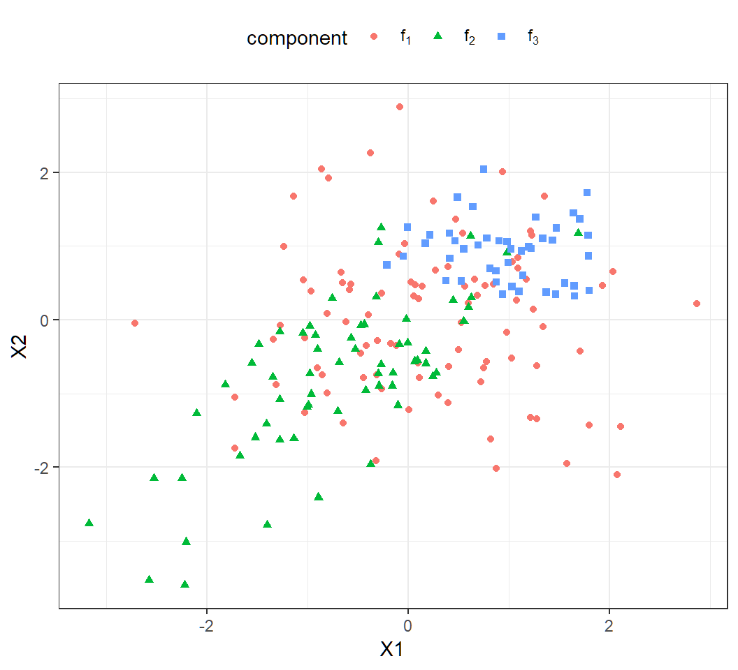
Example 1a: scatter plot
Scatter plot of the observations:
> library(ggplot2)
> ggplot(df2, aes(X1, X2, color=component,shape=component))+
+  geom_point()+theme_bw() +
+  theme(legend.position="top",legend.direction="horizontal")+
+  scale_color_discrete(labels=cpStg)+
+ scale_shape_discrete(labels =cpStg)- note
scale_*_discretefor manually specifyingcolorandshape cpStg: vector of math expressions \(f_1,f_2,f_3\)
Example 1a: scatter plot
Much overlap among the 200 observations
Example 1a: LDA
> library(MASS)
> lda.fit = lda(component~X1+X2,data=df2)
> lda.pred = predict(lda.fit,df2)
> TrueClassLabel=df2$component
> LDAEstimtedClassLabel=lda.pred$class
> table(LDAEstimtedClassLabel,TrueClassLabel)
                     TrueClassLabel
LDAEstimtedClassLabel f[1] f[2] f[3]
                 f[1]   69   29   24
                 f[2]   14   32    0
f[3] 10 1 21- Large error rates: Class 1, 2, 3 error rates respectively are
[1] 0.2580645 0.4838710 0.5333333- LDA not suitable since component covariance matrices are different
Example 1b: LDA
LDA on \(n=10^5\) observations from the mixture
> library(MASS)
> lda.fit = lda(component~X1+X2,data=df1)
> lda.pred = predict(lda.fit,df1)
> TrueClassLabel=df1$component
> LDAEstimtedClassLabel=lda.pred$class
> table(LDAEstimtedClassLabel,TrueClassLabel)
                     TrueClassLabel
LDAEstimtedClassLabel  f[1]  f[2]  f[3]
                 f[1] 25341  9397  4702
                 f[2]  7277 19776     0
f[3] 7220 1110 25177- Large error rates: Class 1, 2, 3 error rates respectively are
[1] 0.3638988 0.3469603 0.1573681- LDA not suitable; larger sample size does not necessarily help when model is mis-applied
Example 1c: QDA
QDA on the 200 observations:
> library(MASS)
> qda.fit = qda(component~X1+X2,data=df2)
> qda.pred = predict(qda.fit,df2)
> TrueClassLabel=df2$component
> QDAEstimtedClassLabel=qda.pred$class
> table(QDAEstimtedClassLabel,TrueClassLabel)
                     TrueClassLabel
QDAEstimtedClassLabel f[1] f[2] f[3]
                 f[1]   63   26    5
                 f[2]   15   33    0
f[3] 15 3 40- Large error rates: Class 1, 2, 3 error rates respectively are
[1] 0.3225806 0.4677419 0.1111111- QDA suitable but considerable overlap among observations
Example 1d
QDA on \(n=10^5\) observations from the mixture:
> library(MASS)
> qda.fit = qda(component~X1+X2,data=df1)
> qda.pred = predict(qda.fit,df1)
> TrueClassLabel=df1$component
> QDAEstimtedClassLabel=qda.pred$class
> table(QDAEstimtedClassLabel,TrueClassLabel)
                     TrueClassLabel
QDAEstimtedClassLabel  f[1]  f[2]  f[3]
                 f[1] 27336  8683  3105
                 f[2]  5828 20084     0
f[3] 6674 1516 26774- Large error rates: Class 1, 2, 3 error rates respectively are
[1] 0.3138210 0.3367896 0.1039191- QDA suitable; considerable overlap among observations; larger sample size improves classification accuracy
Example 1e: model
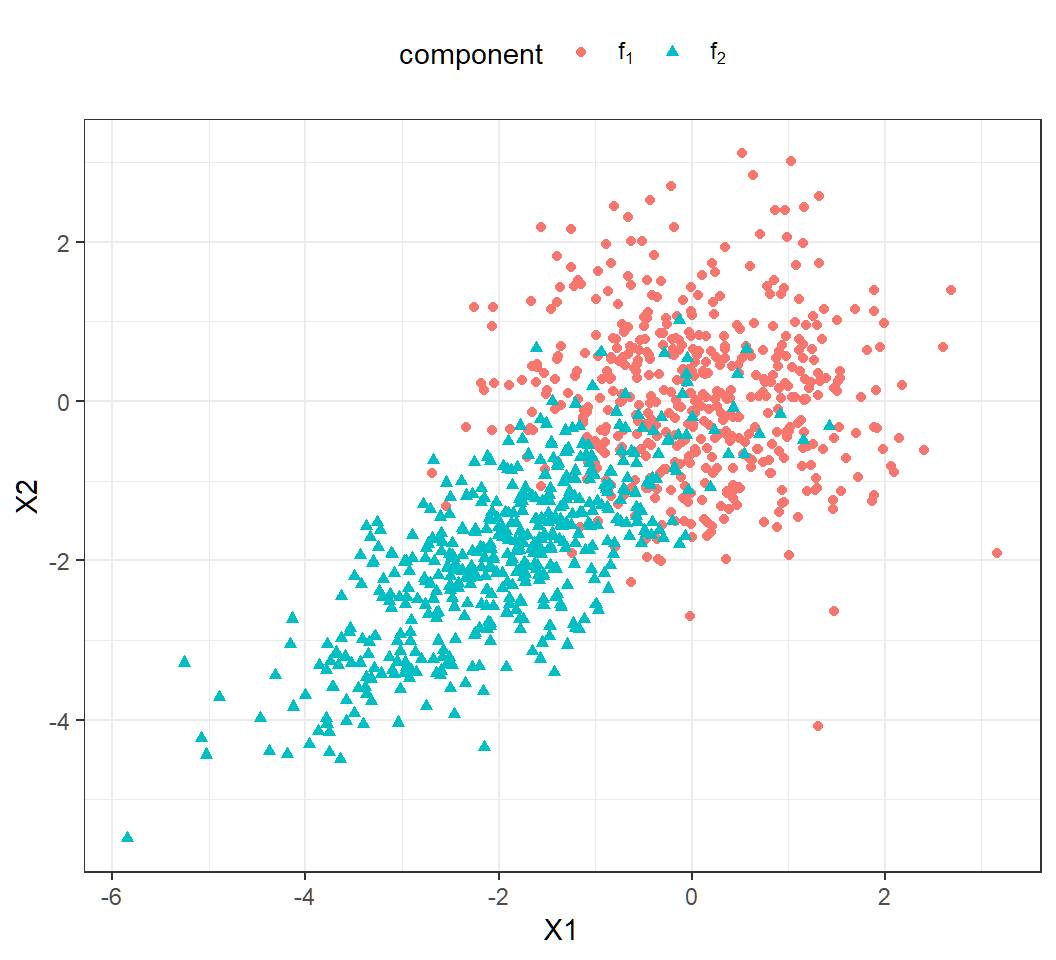
Gaussian mixture for \(K=2\) classes and \(p=2\) features with
Class 1 and 2 mixing proportions: \(\pi_1=\pi_2=0.5\)
Class 1 and 2 components: \[f_1(x)\sim \text{Gaussian}(\mu_1=(0,0)^T,\Sigma_1=\mathbf{I}),\] \[f_2(x)\sim \text{Gaussian}\left(\mu_2=(-2,-2)^T,\Sigma_2=\left(\begin{array}{cc} 1 & 0.7\\ 0.7 & 1 \end{array}\right)\right)\]
marginal: \(f(x)= \sum_{k=1}^2 \pi_k f_k(x)\) (not Gaussian)
Example 1e: generate data
Randomly generate \(1000\) observations:
> set.seed(2)
> n=1000; cpb=c(0.5,0.5)
> clbs = sample(1:2,n,replace = T, prob=cpb)
> n1=length(clbs[clbs==1]); n2=length(clbs[clbs==2]);
> library(mvtnorm)
> x1=rmvnorm(n1, mean=c(0,0), sigma=diag(2));
> Sg2= matrix(c(1,0.7,0.7,1),nrow=2);
> x2=rmvnorm(n2, mean=c(-2,-2), sigma=Sg2);
> proportion = c(rep(cpb[1],n1),rep(cpb[2],n2))
> component=c(rep(1,n1),rep(2,n2))
> observation = rbind(x1,x2)
> colnames(observation)=c("X1","X2")
> df3=data.frame(cbind(observation,proportion,component))
> cpStg=c(expression(f[1]),expression(f[2]))
> df3$component = factor(df3$component,labels=cpStg)
Example 1e: scallter plot
A bit overlap among observations (\(n=1000\)):
Example 1e: QDA
QDA results:
                     TrueClassLabel
QDAEstimtedClassLabel f[1] f[2]
                 f[1]  461   54
f[2] 36 449- Error rates: Class 1, 2 error rates respectively are
> c1er=1-sum(qda.pred$class[df3$component=="f[1]"] =="f[1]")/
+          sum(df3$component=="f[1]")
> c2er=1-sum(qda.pred$class[df3$component=="f[2]"] =="f[2]")/
+          sum(df3$component=="f[2]")
> c(c1er,c2er)
[1] 0.07243461 0.10735586- QDA suitable; a bit overlap among observations; larger sample size improves classification
Example 1e: QDA ROC
> rocplot(qda.pred$posterior[,2],TrueClassLabel)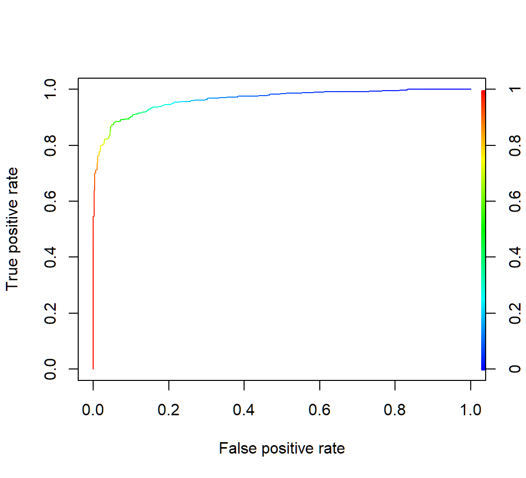
Example 1e: QDA AUC
AUC:
> library(dplyr); library(ROCR)
> aucStdThr =
+  ROCR::prediction(qda.pred$posterior[,2],TrueClassLabel) %>%
+   ROCR::performance(measure = "auc") %>%
+   .@y.values
> as.numeric(aucStdThr)
[1] 0.9642907
ROCR::performance(measure = "auc"): obtain performance via AUC
Discriminant analysis: Example 2
Default data
Default data set (in R library ISLR) on credit card users:
- 2 classes as statuses of
defaultof a user on credit card payments, wheredefaulttakes valueYesorNo
- 3 features on each user: annual
income, monthly credit cardbalance, user beingstudent(with valueYes) or not (with valueNo) - \(n=10,000\) training observations: 333 observations are for
default=Yes, and the restdefault=No
Target: apply DA to classify a user’s status of default using some of the features
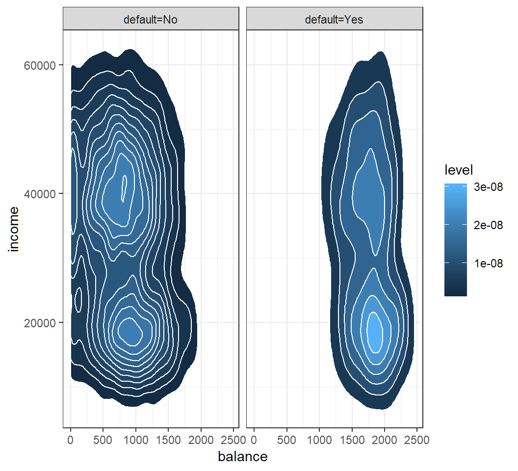
Model assumption
Check Gaussian assumption: student hidden in contours
QDA: classification
Classification results of QDA with features balance and income on training set and “0.5-threshold rule” of default=Yes if \(\widehat{\Pr}(\text{default}=\text{Yes}|X=x)>0.5\):
> library(MASS)
> qda.fit = qda(default~balance+income,data=Default)
> qda.pred = predict(qda.fit,Default)
> TrueClassLabel=Default$default
> QDAEstimtedClassLabel=qda.pred$class
> table(QDAEstimtedClassLabel,TrueClassLabel)
                     TrueClassLabel
QDAEstimtedClassLabel   No  Yes
                  No  9637  241
                  Yes   30   92
AUC:
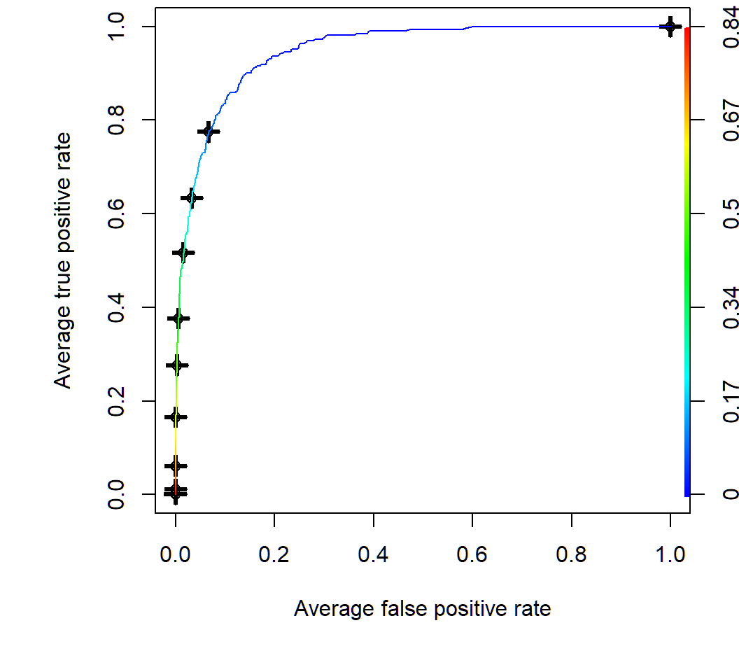
[1] 0.9489247QDA: ROC curve by CV
Average of 10 ROC curves obtained by 10-fold cross-validation:
> par(mfrow=c(1,1),mar=c(4.6,4.5,.0,.5),oma=c(1.3,1.3,0.3,1.3))
> predqda = prediction(qda.pred$posterior[,2], TrueClassLabel)
> perfroc = performance(predqda, "tpr", "fpr")
> plot(perfroc,avg="threshold",spread.estimate="boxplot",
+ colorize=TRUE)avg="threshold": averaging via cutoff 10 ROC curves obtained by 10-fold cross-validationspread.estimate="boxplot": provide boxplot as variation around the average curvecolorize=TRUE: show cutoff values via color key
QDA: ROC curve by CV
Average of 10 ROC curves obtained by 10-fold cross-validation; color key for threshold value
Modified QDA
Modified decision rule: \(\widehat{\Pr}(\text{default}=\text{Yes}|X=x)>0.2\)
> library(ISLR); library(MASS)
> qda.fit = qda(default~balance+income,data=Default)
> qda.pred = predict(qda.fit,Default)
> TrueClassLabel=Default$default
> # create estimated class labels vector of all "No"'s
> mQDAEstimtedClassLabel = rep("No",nrow(Default))
> # Pr(default=Yes|X) > 0.2 as threshold rule
> YesIdx=which(qda.pred$posterior[,2]>0.2)
> mQDAEstimtedClassLabel[YesIdx] = "Yes"
> table(mQDAEstimtedClassLabel,TrueClassLabel)
                      TrueClassLabel
mQDAEstimtedClassLabel   No  Yes
                   No  9348  123
Yes 319 210YesIdx=...: R takes classdefault=Yesas the 2nd class andqda.pred$posterior[,2]contains posterior probabilities for the 2nd class
License and session Information
> sessionInfo()
R version 3.5.0 (2018-04-23)
Platform: x86_64-w64-mingw32/x64 (64-bit)
Running under: Windows 10 x64 (build 19041)

Matrix products: default

locale:
[1] LC_COLLATE=English_United States.1252
[2] LC_CTYPE=English_United States.1252
[3] LC_MONETARY=English_United States.1252
[4] LC_NUMERIC=C
[5] LC_TIME=English_United States.1252

attached base packages:
[1] stats     graphics  grDevices utils     datasets  methods
[7] base

other attached packages:
[1] knitr_1.21

loaded via a namespace (and not attached):
 [1] compiler_3.5.0  magrittr_1.5    tools_3.5.0
 [4] htmltools_0.3.6 revealjs_0.9    yaml_2.2.0
 [7] Rcpp_1.0.0      stringi_1.2.4   rmarkdown_1.11
[10] highr_0.7       stringr_1.3.1   xfun_0.4
[13] digest_0.6.18   evaluate_0.12